T&S are two of our favourite past clients. Although we didn’t design their last large scale renovation, we had a large part to play in the execution. They so liked our attention to detail and commitment to quality that when they moved back to Vancouver after a few years back East, they enlisted us in helping them find a place that we could help turn into their dream home. After a search, they settled on an 11th floor penthouse in the Olympic Village.
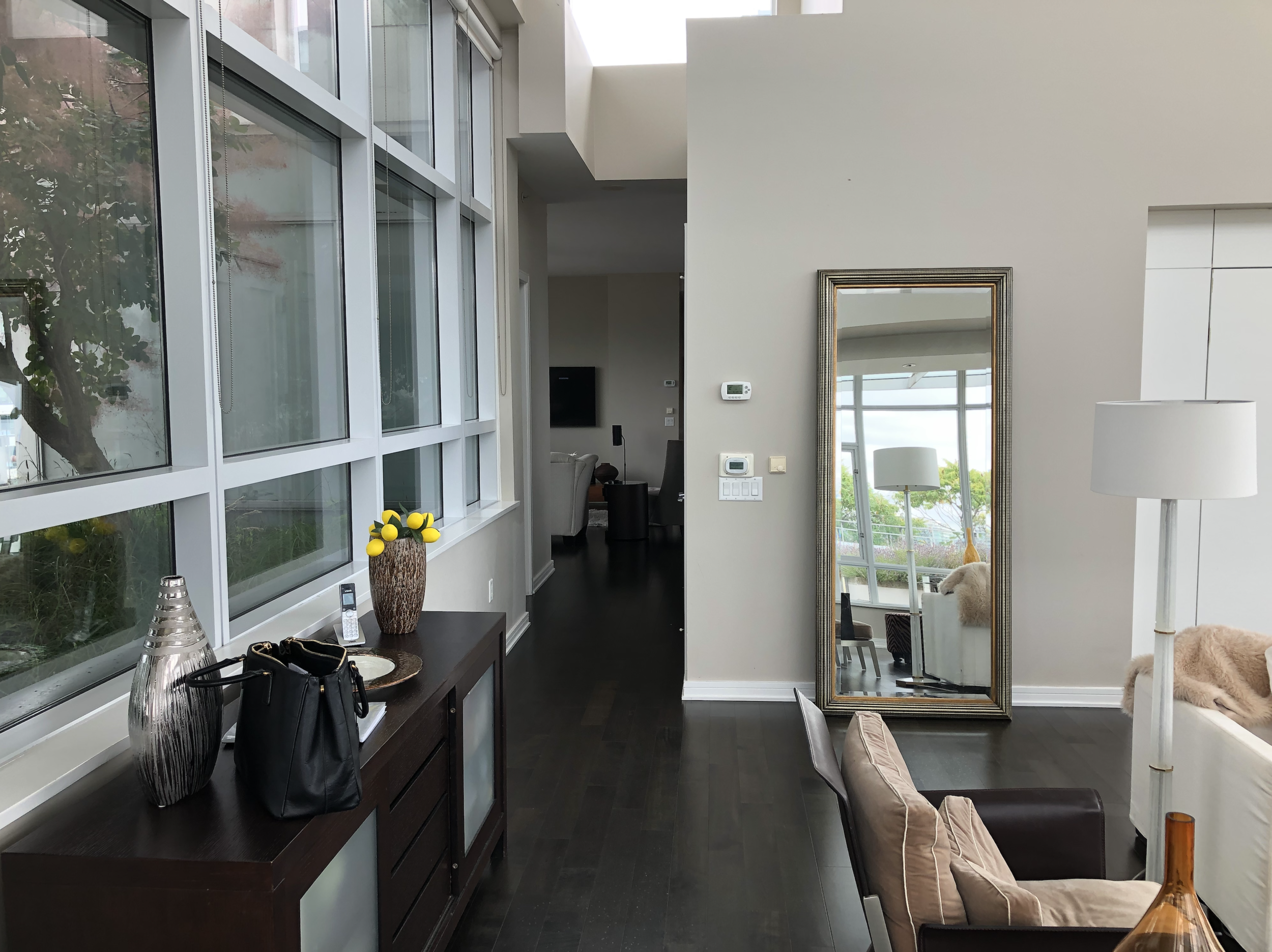
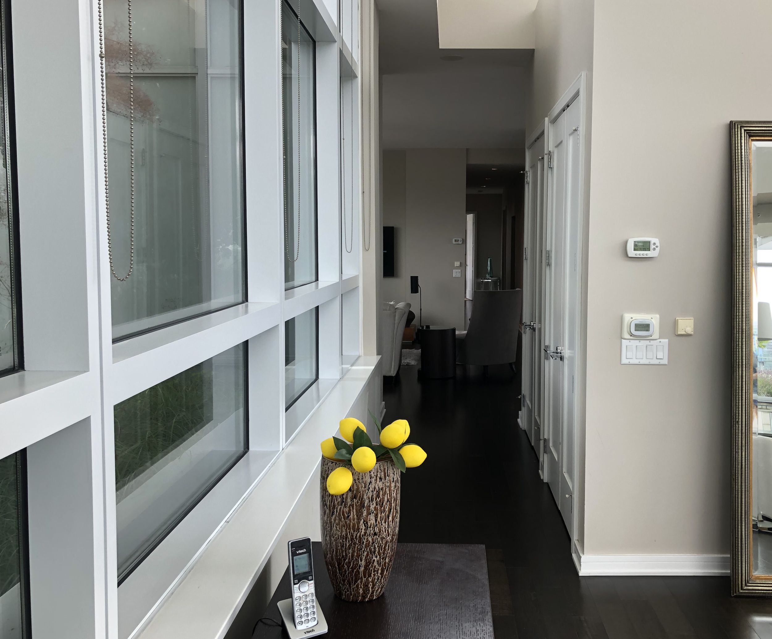
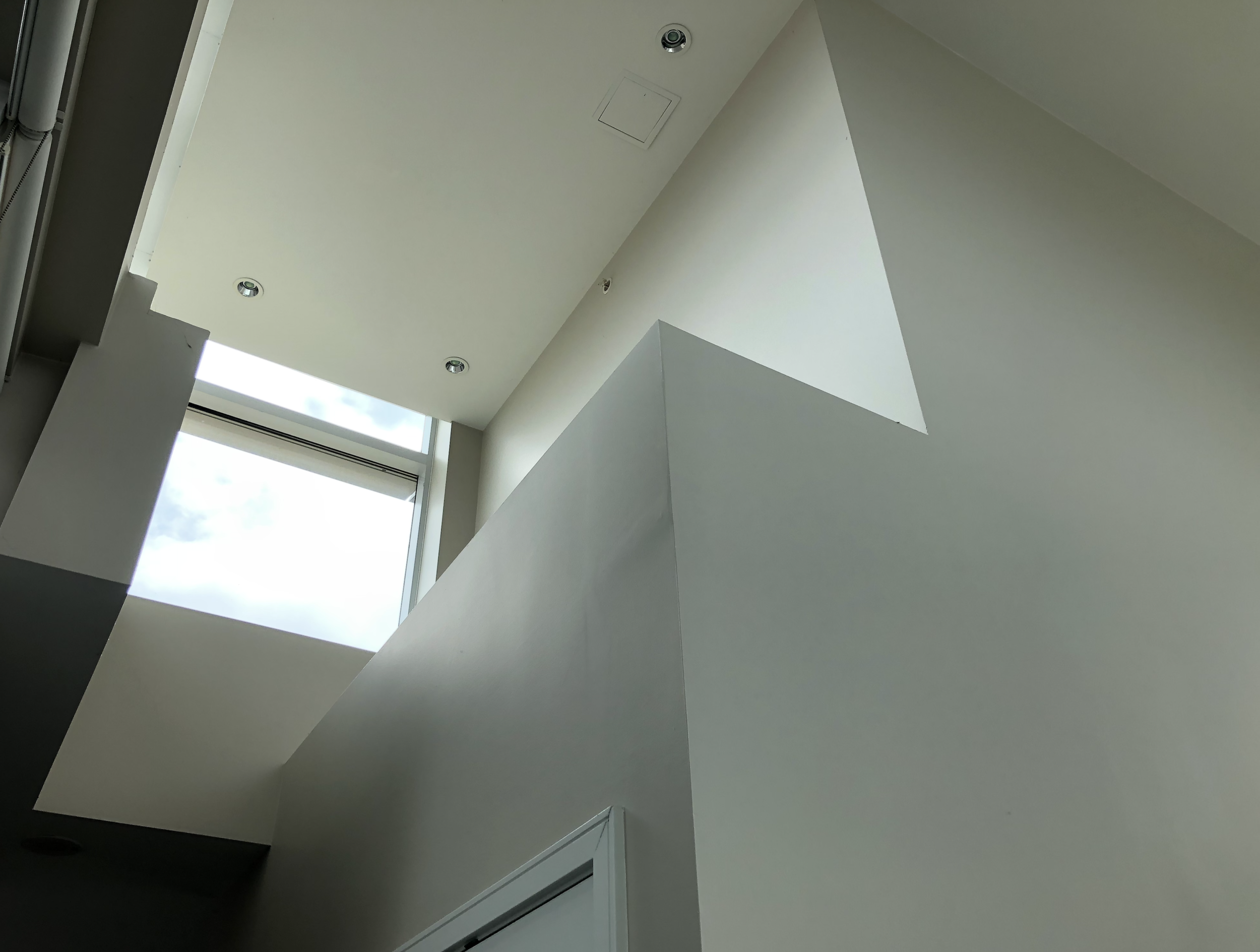
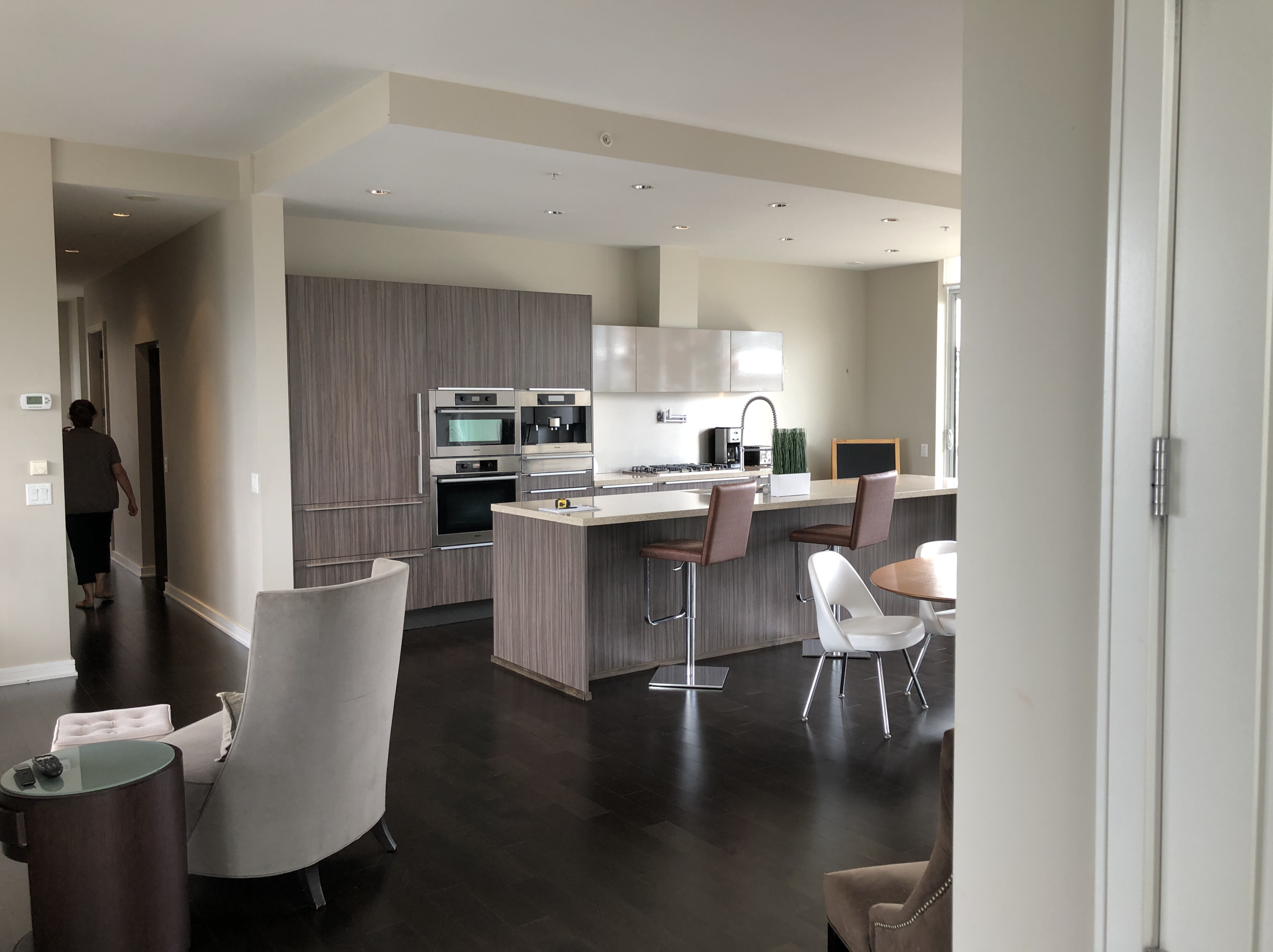
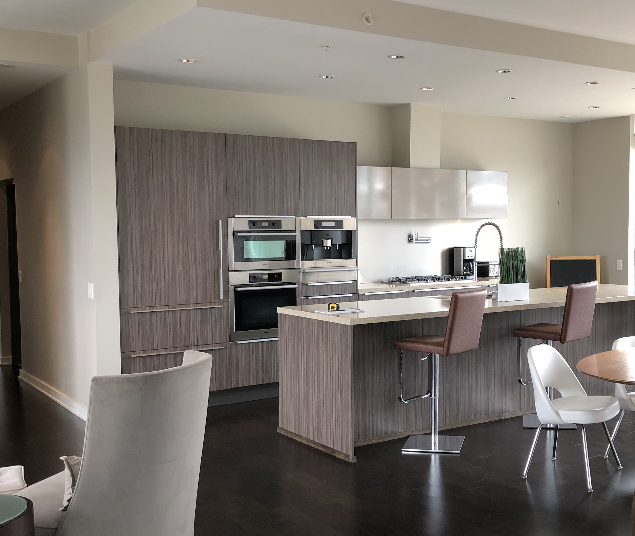
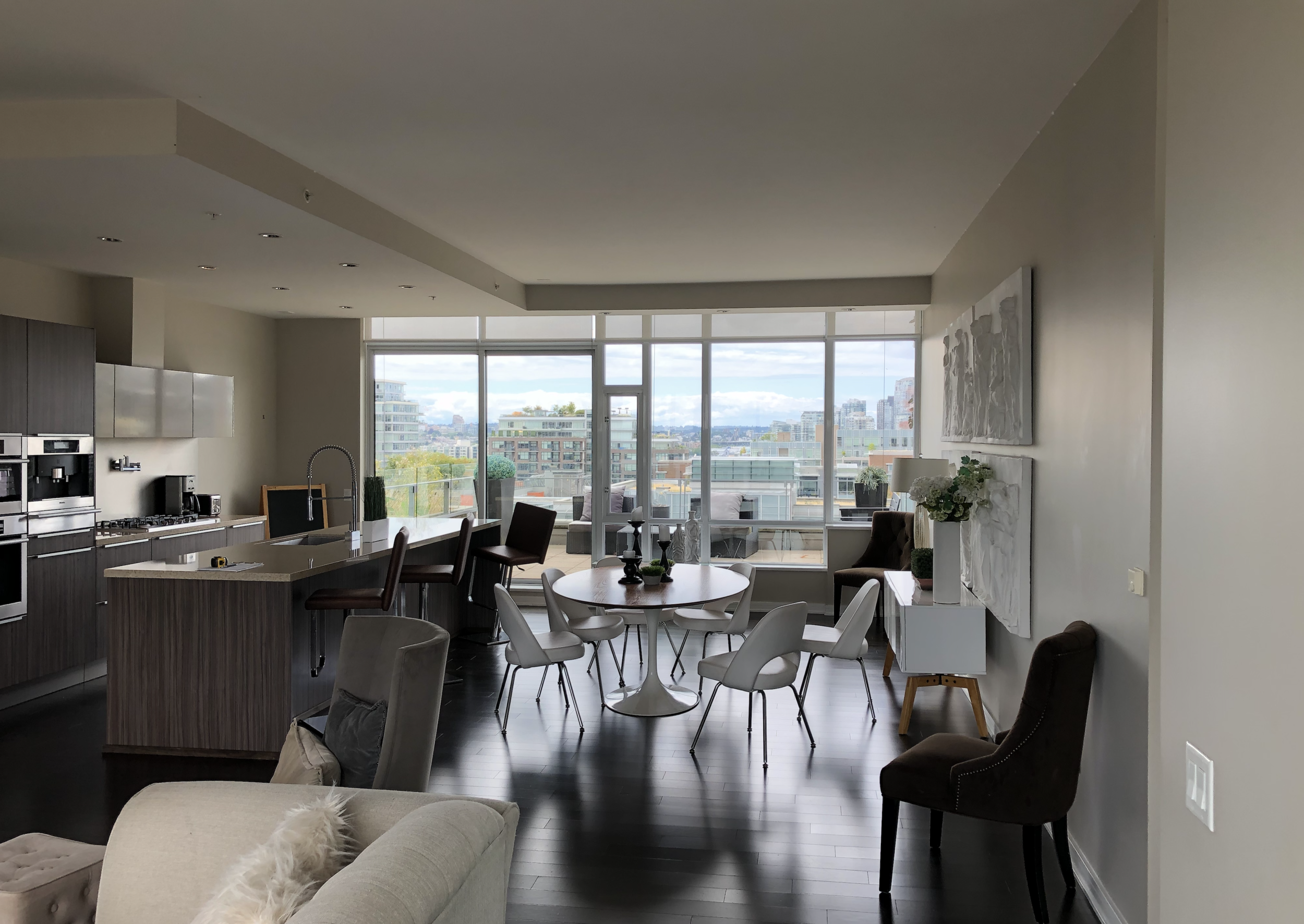
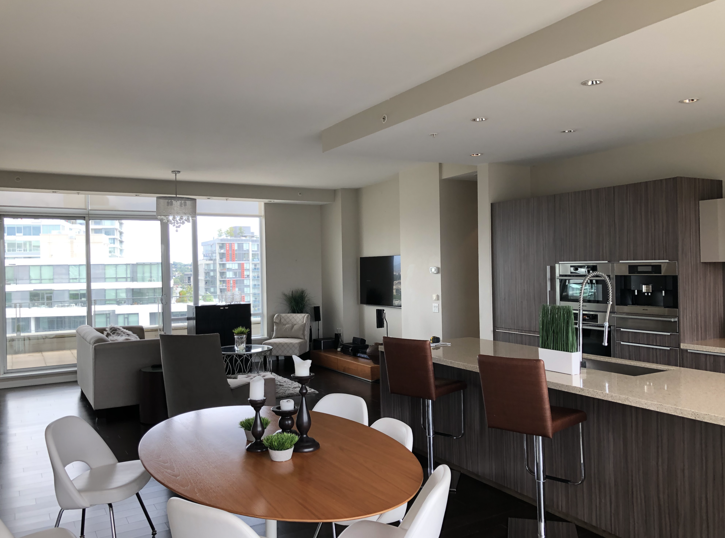
We saw the place before they had even signed the papers and talked over a few possibilities with them making sure it would work for what they were hoping to achieve. With the whole apartment perched on the roof, glass doors led out to multiple large decks with unobstructed views of the North Shore mountains, False Creek, and the sunset. The natural lighting streaming in through all the windows made for a bright, airy feel to the apartment. It also, however, showed up the scratched floors, dirty carpets, cheap cabinetry, and dated design. In fact, the whole apartment was so full of bad design decisions, or rather, non-decisions, that it was hard to see past them to the home’s true potential. We started from scratch and reconsidered it from the concrete slab up.
Exiting the elevator into the suite, you are greeted with a fantastic view of the North shore over an extensive terrace. How do you compete with that view? The answer is you don’t. You only try to draw more attention to it. We decided to clean up all the jogs in the drywall to reduce the visual clutter and incorporated some large soft curves into the structural beam. These small tweaks really help to frame the mountains in an almost postcard effect. A large fan, large sofa, and double patio doors make this a bright and breezy room to enjoy the day in.
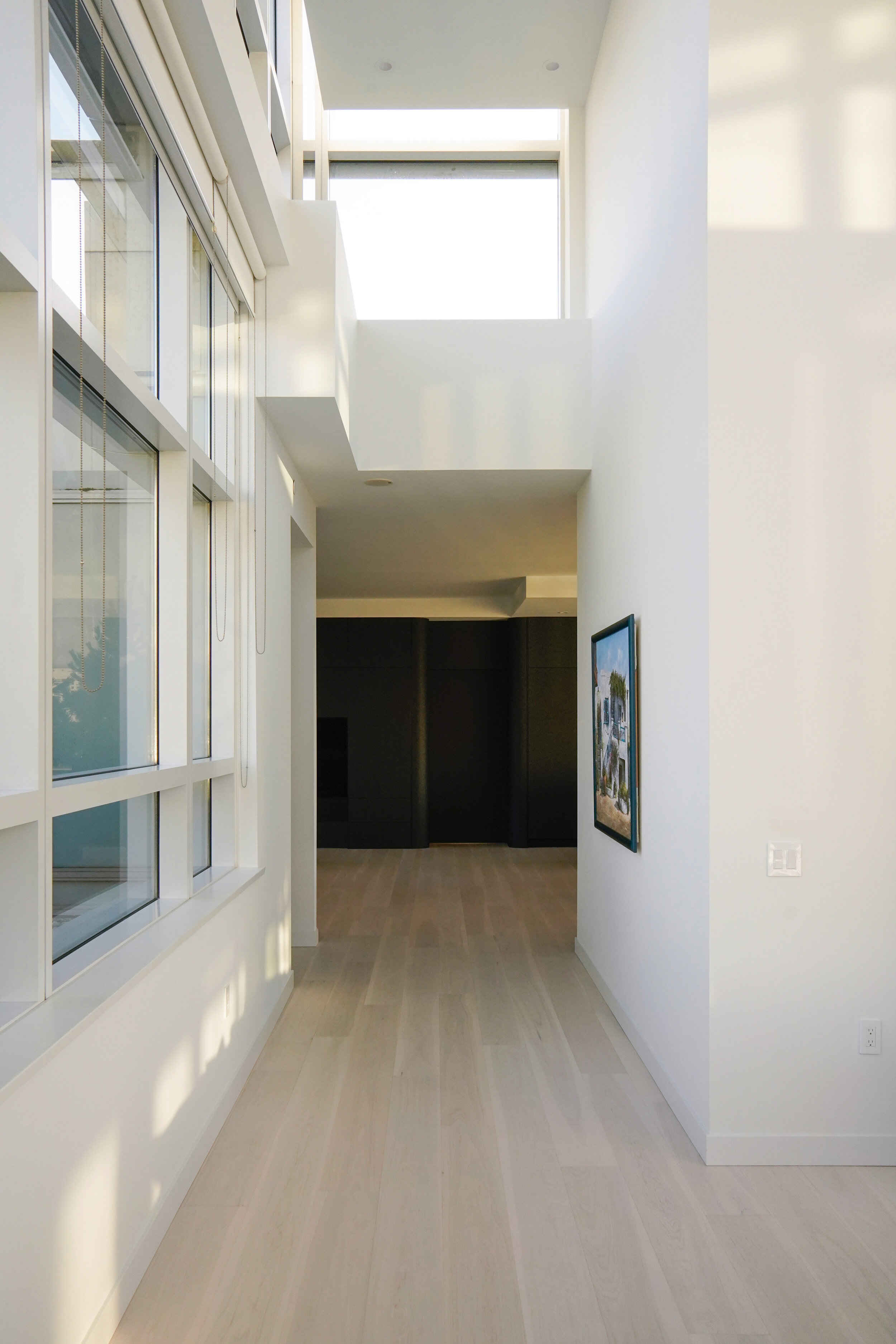
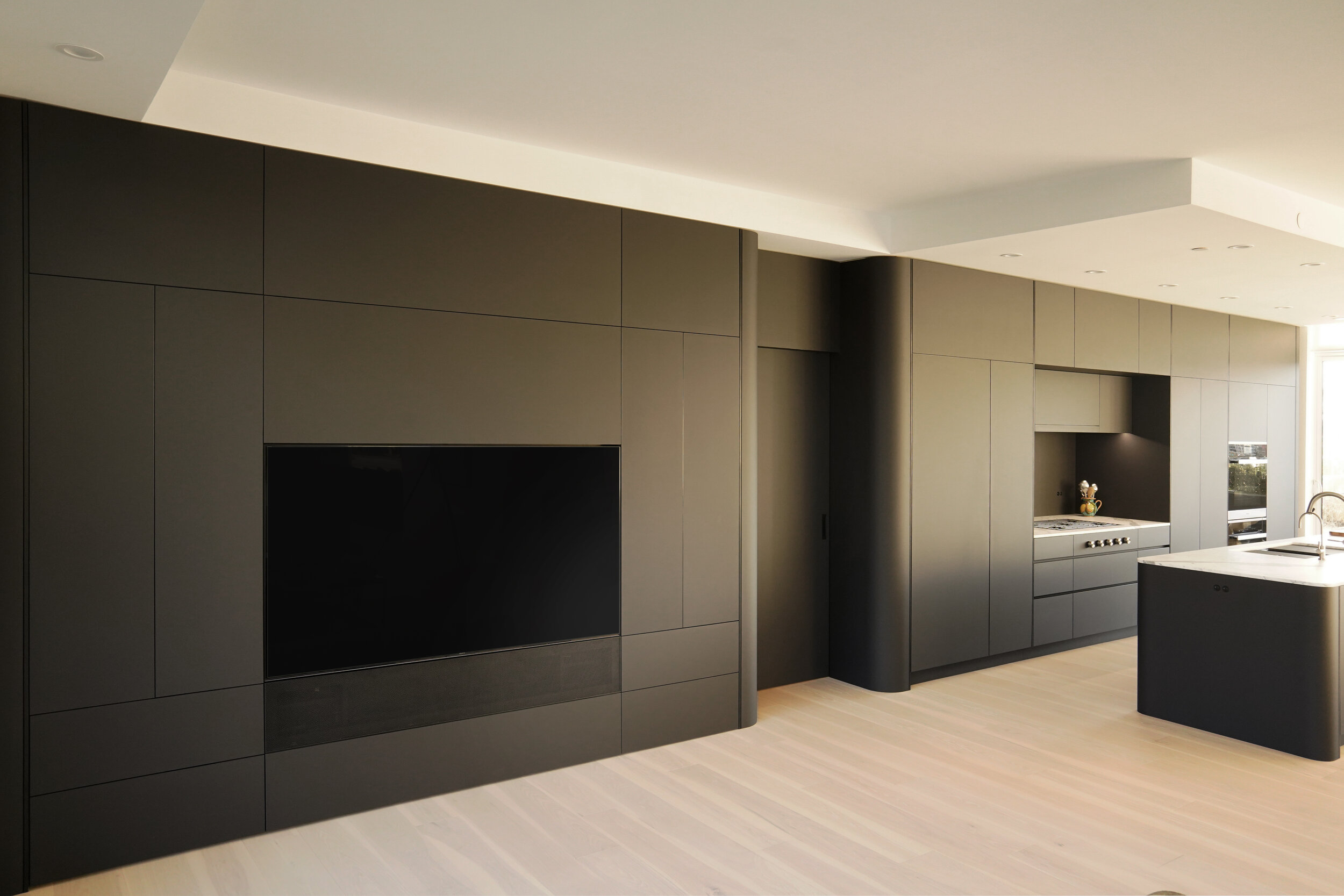
The front room felt really disconnected from the rest of the apartment in the original layout. We relocated a large coat closet to the other side in front of a more suitably sized powder room. This managed to open up the corridor leading to the living space where the kitchen, dining, and TV share the large room with windows and patios on both the east and west walls.
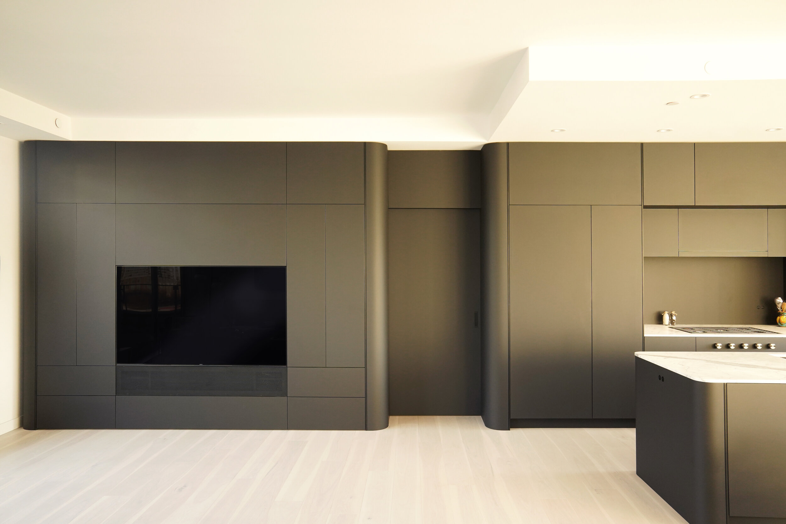
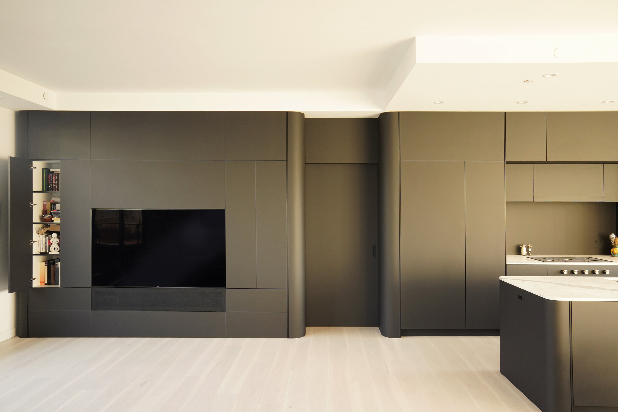
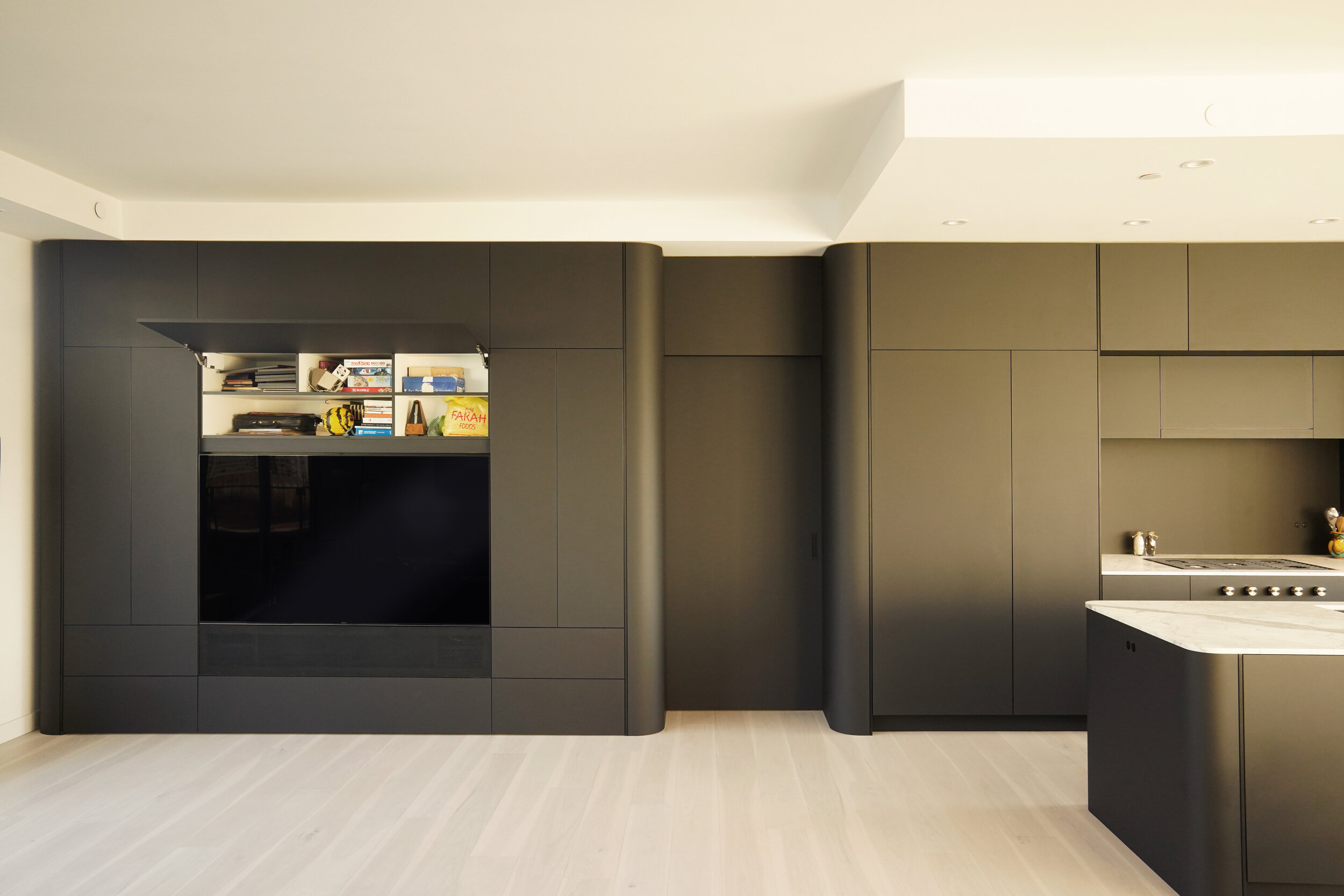
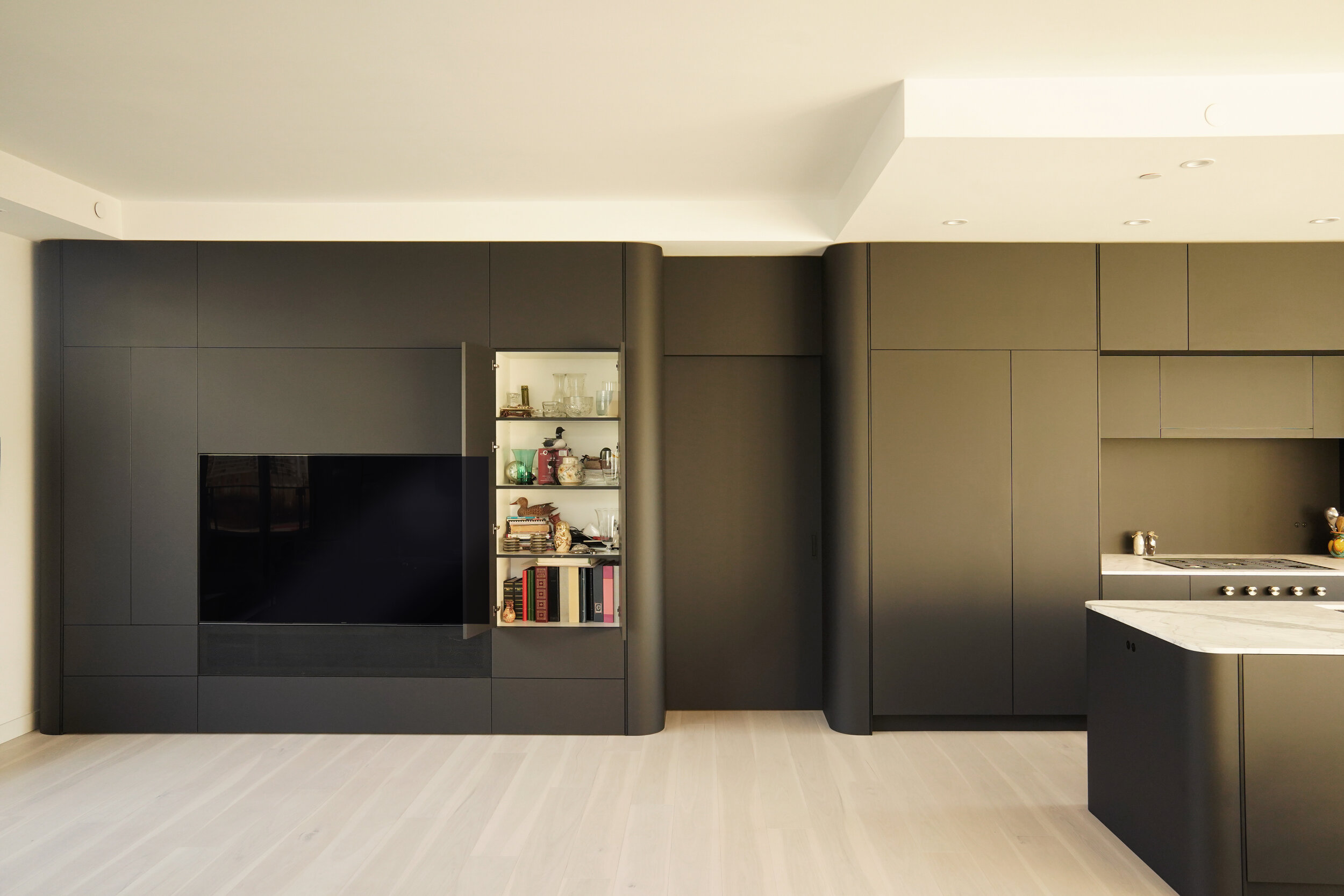
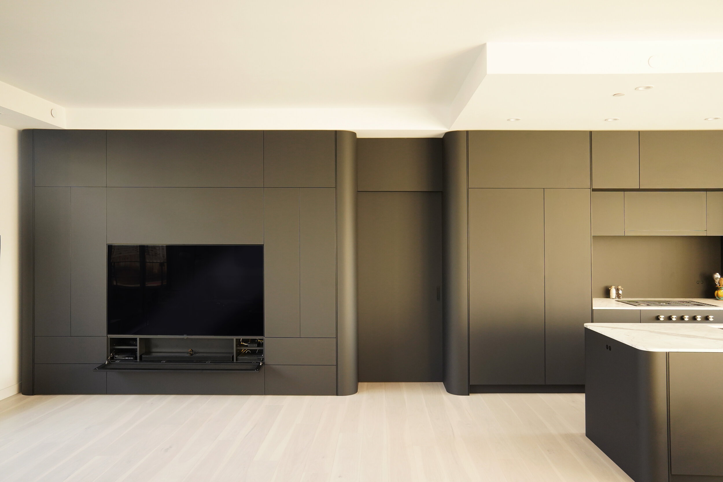
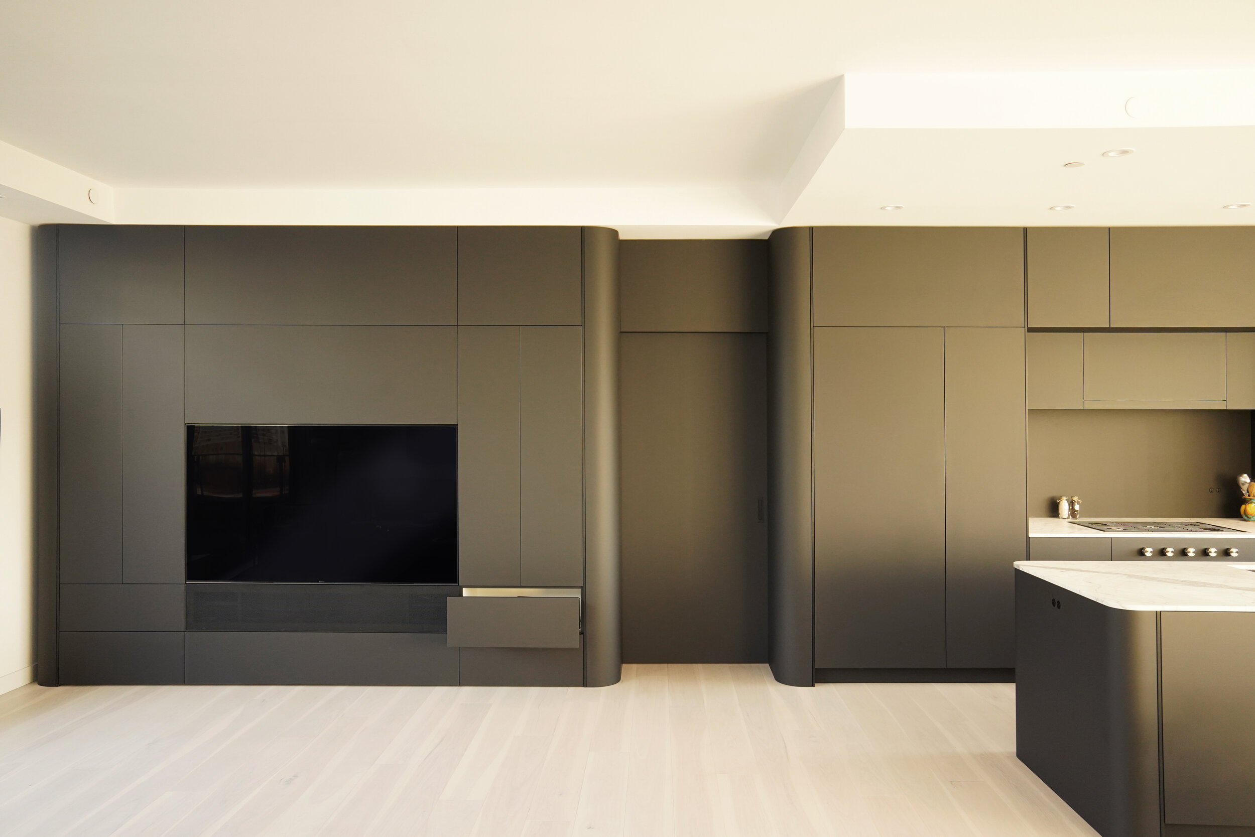
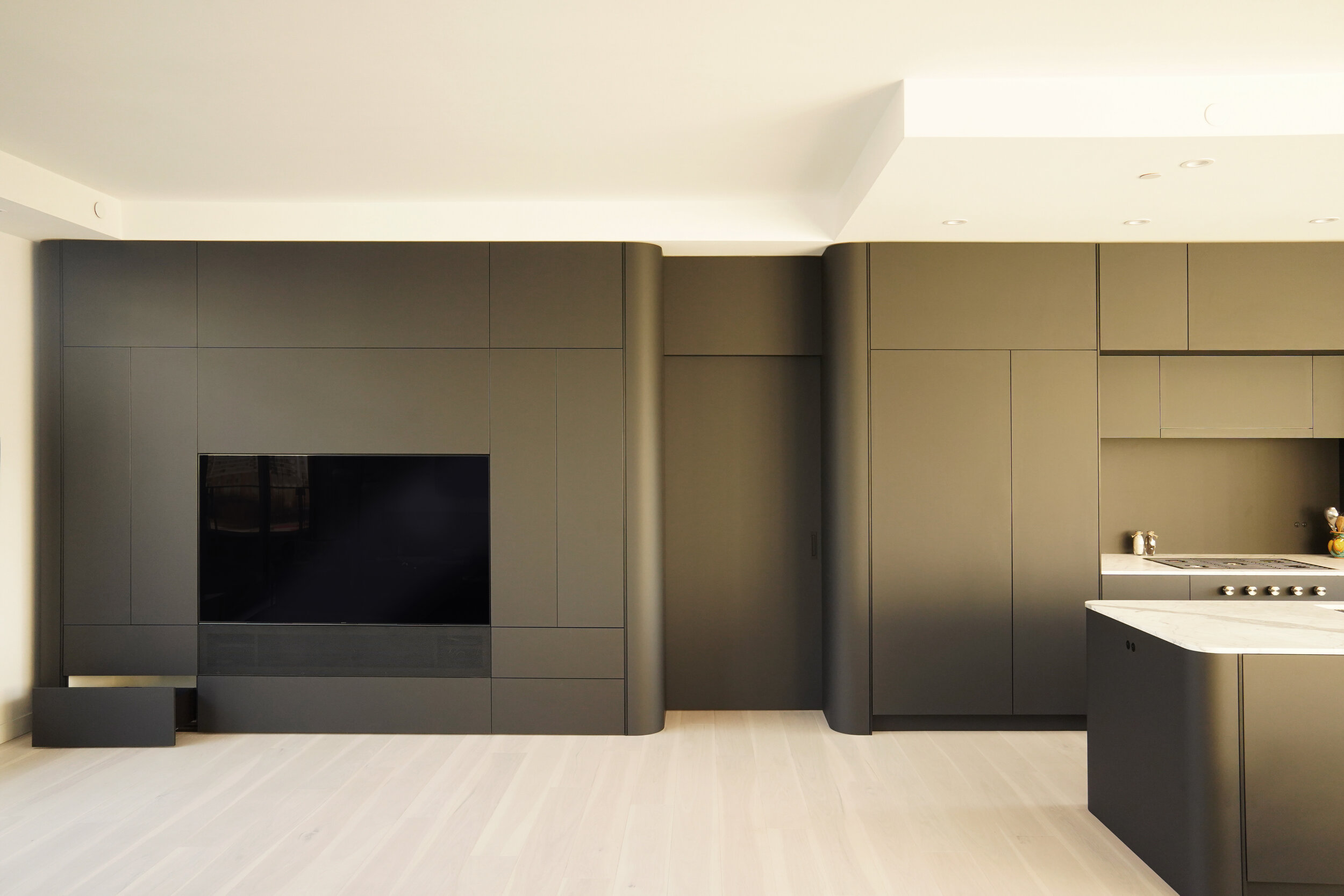
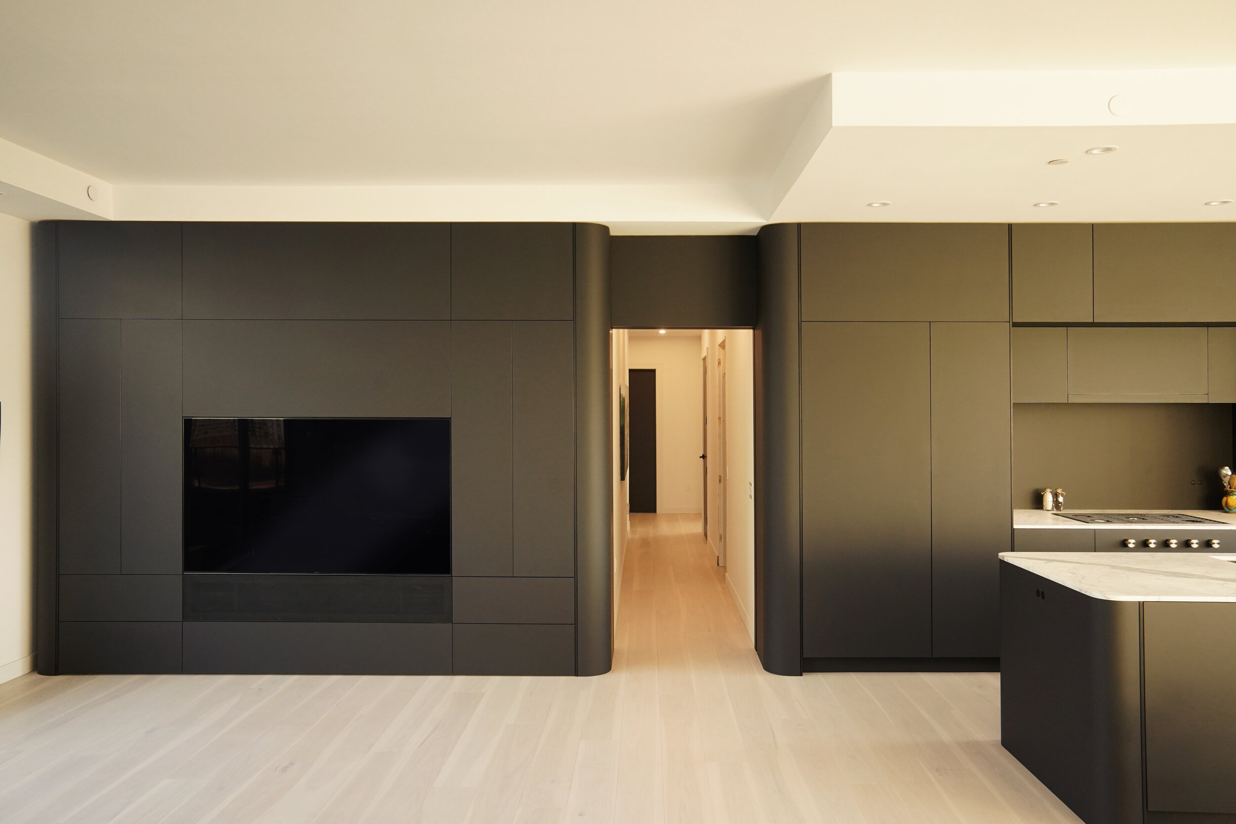
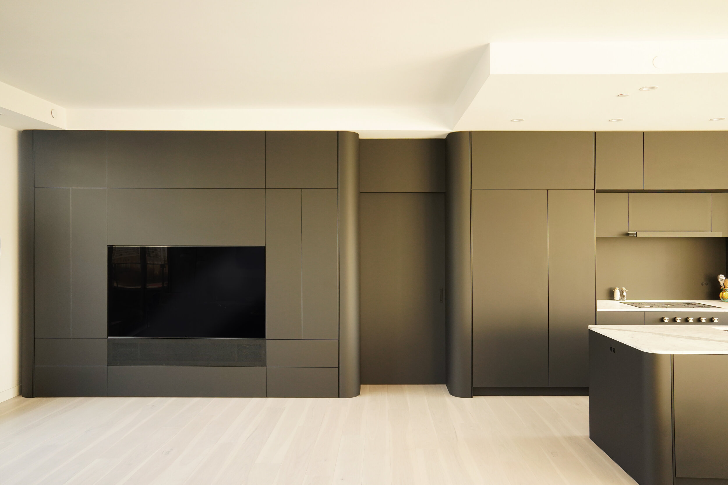
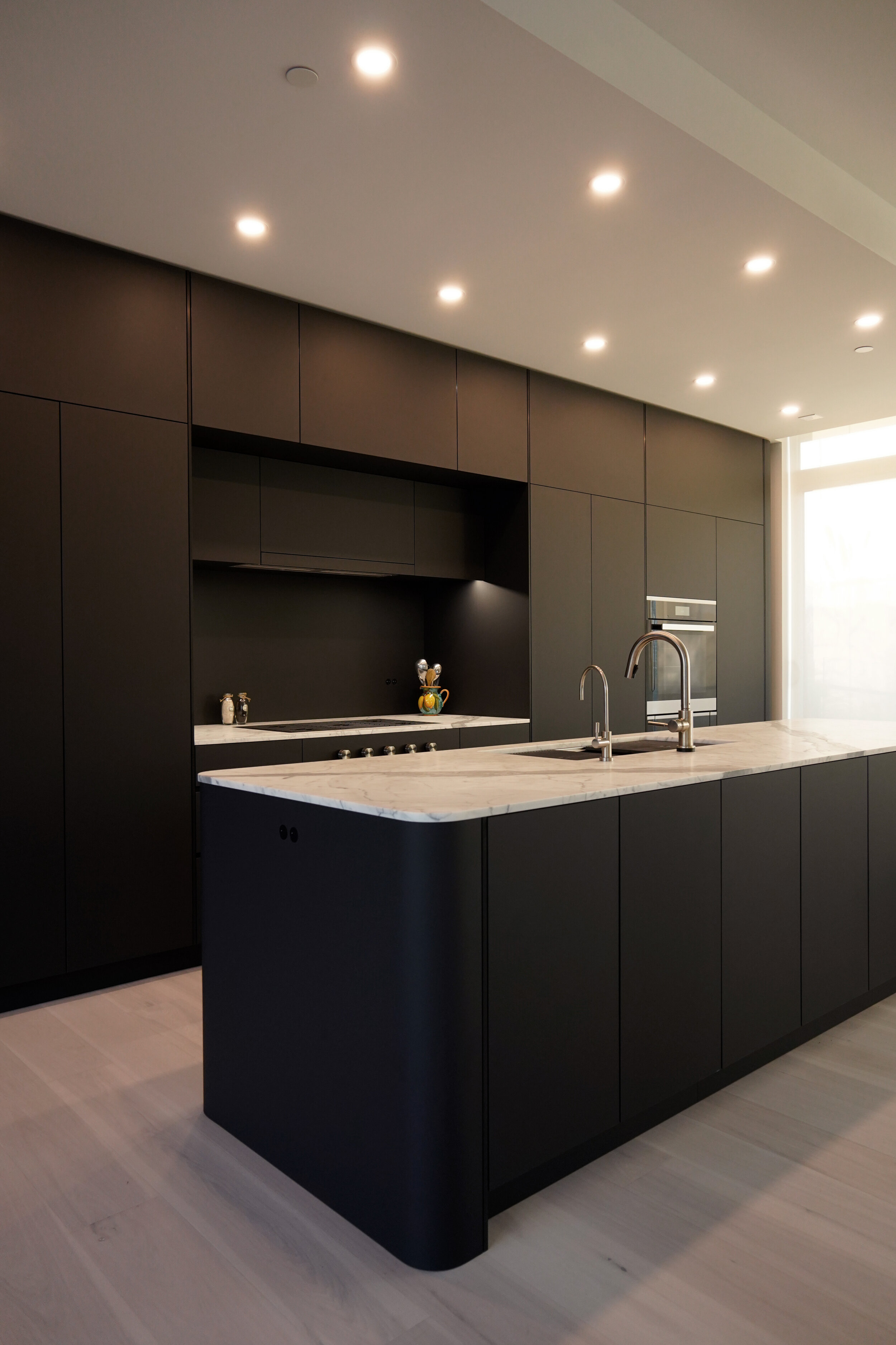
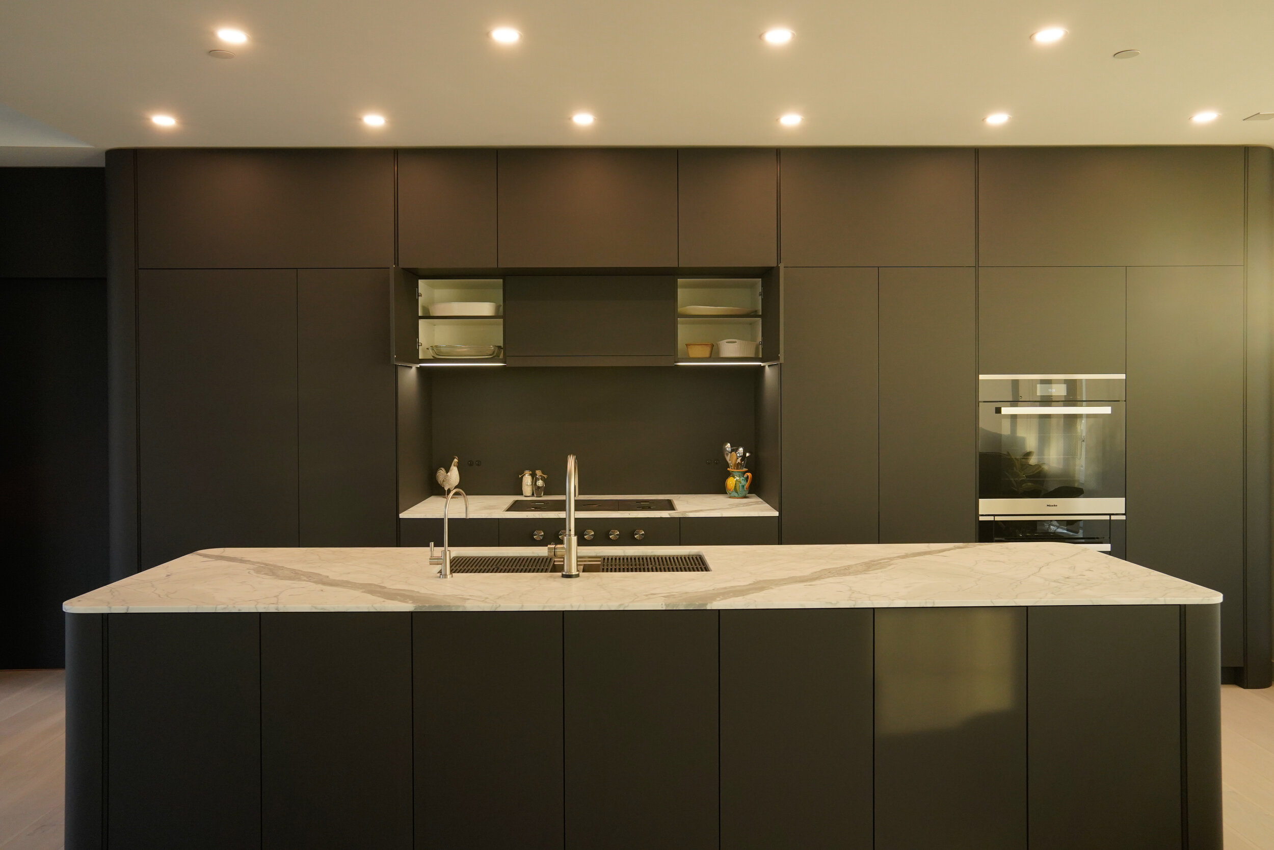
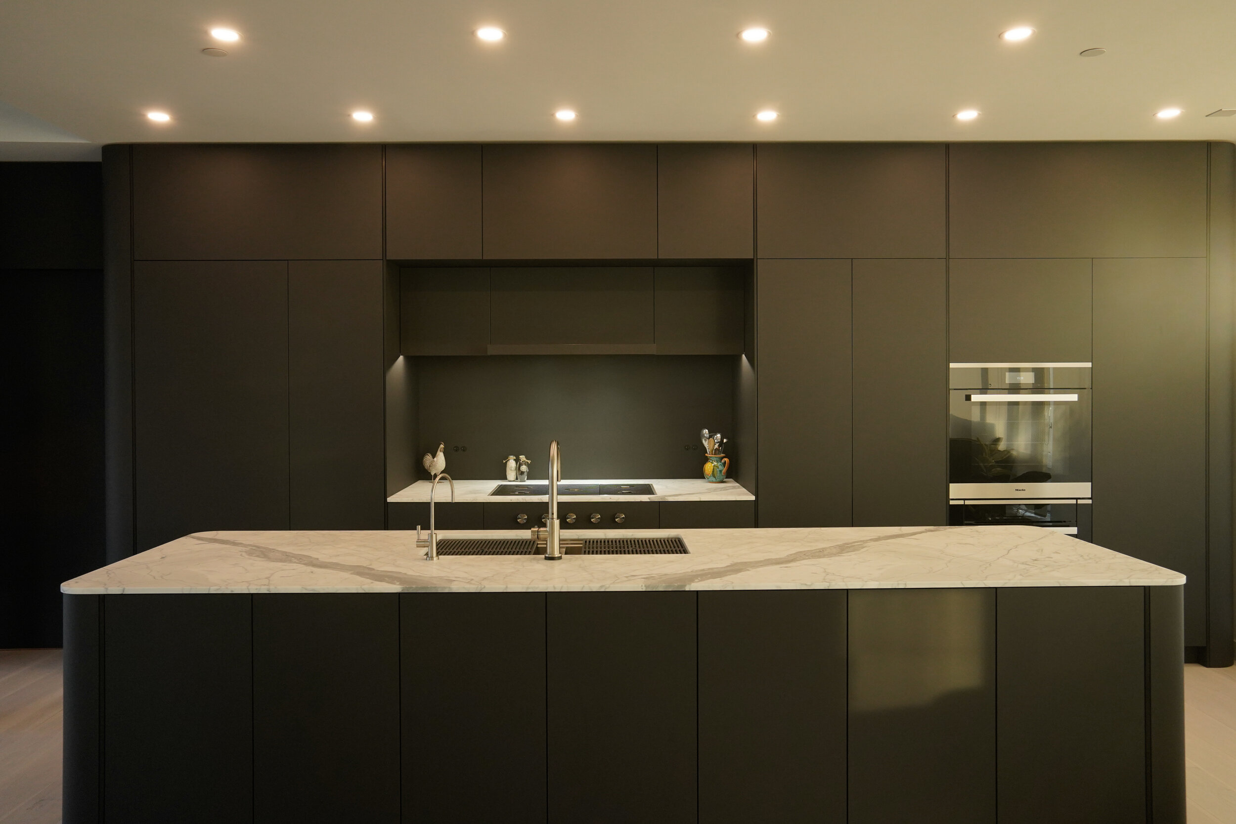
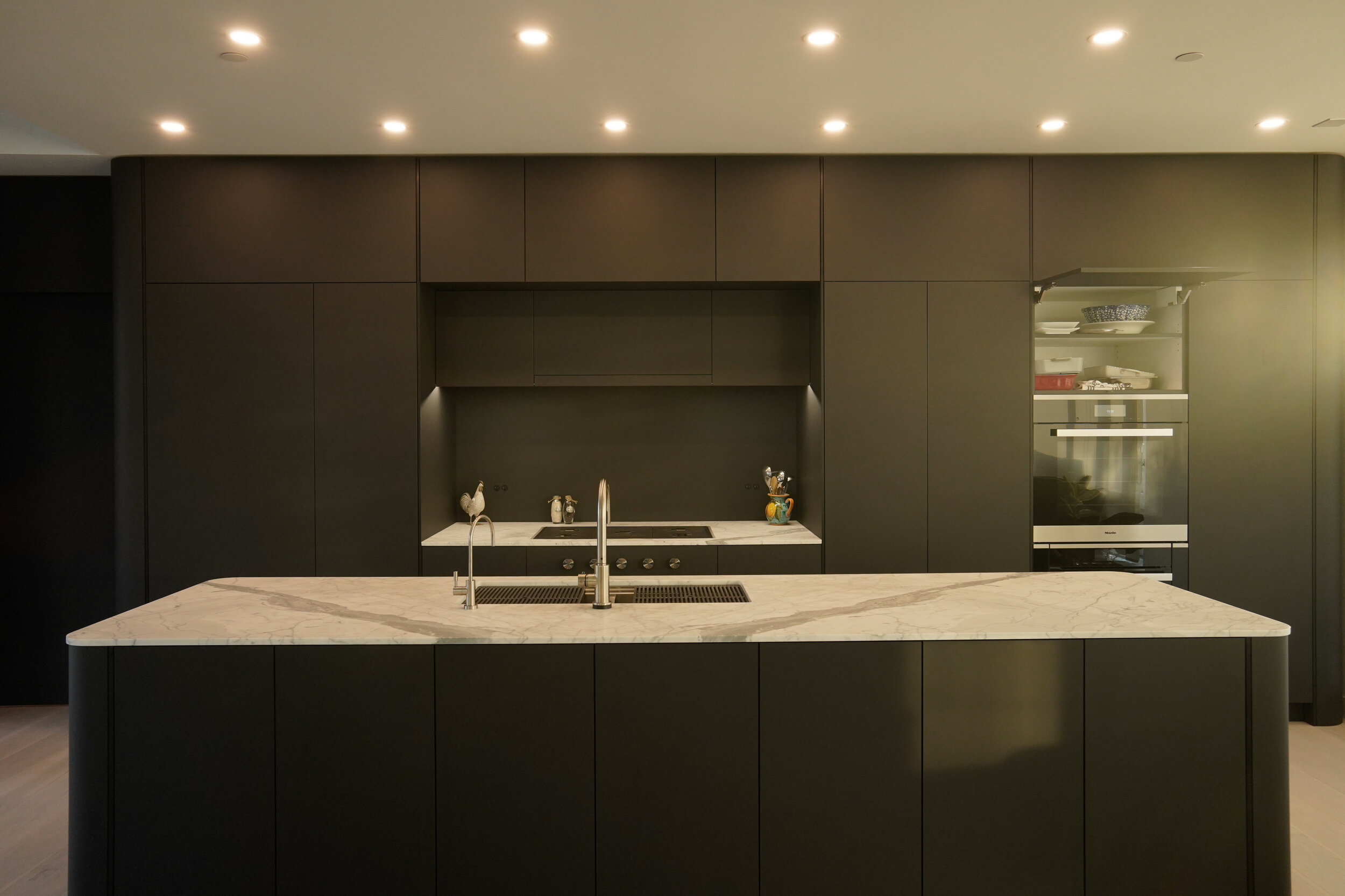
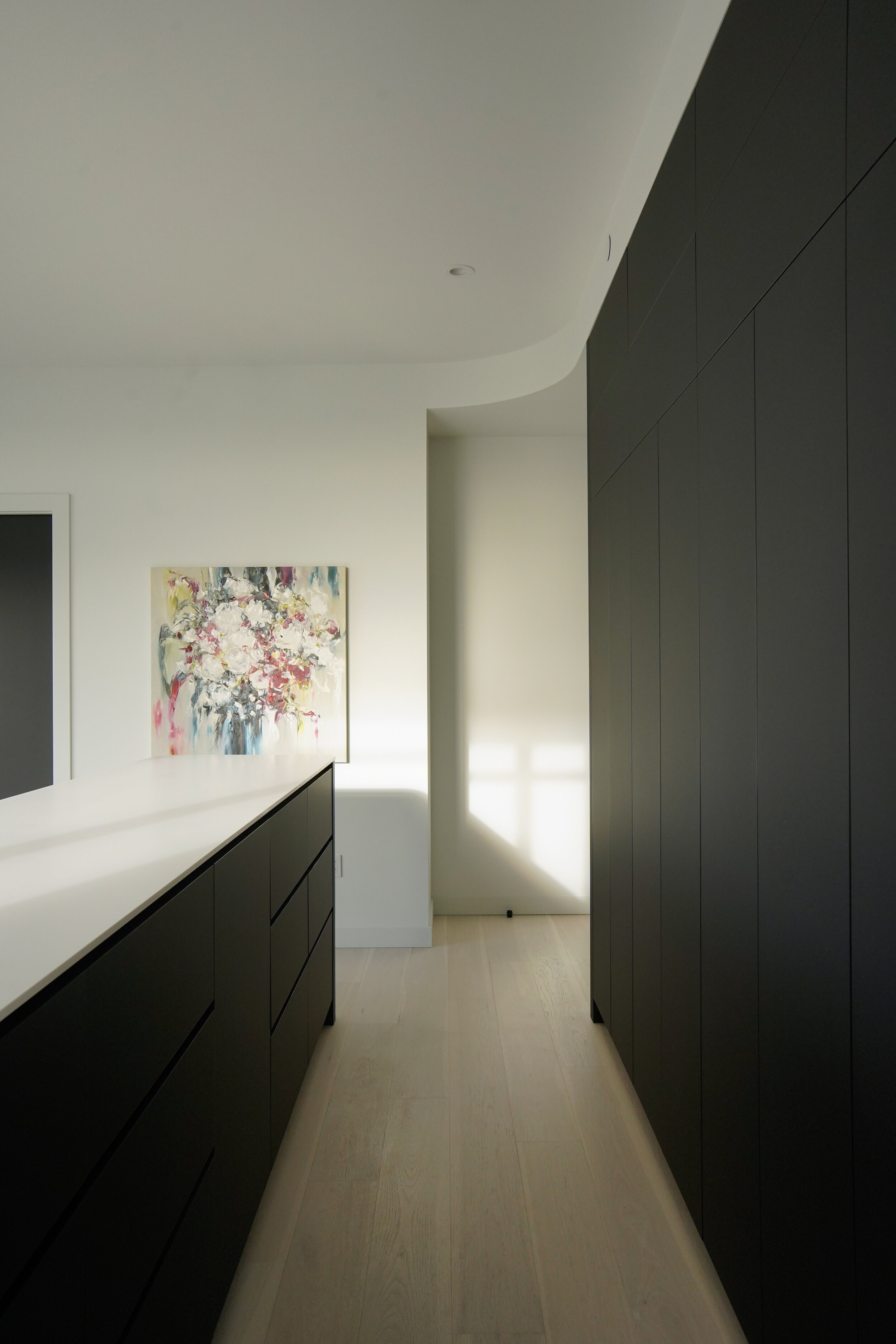
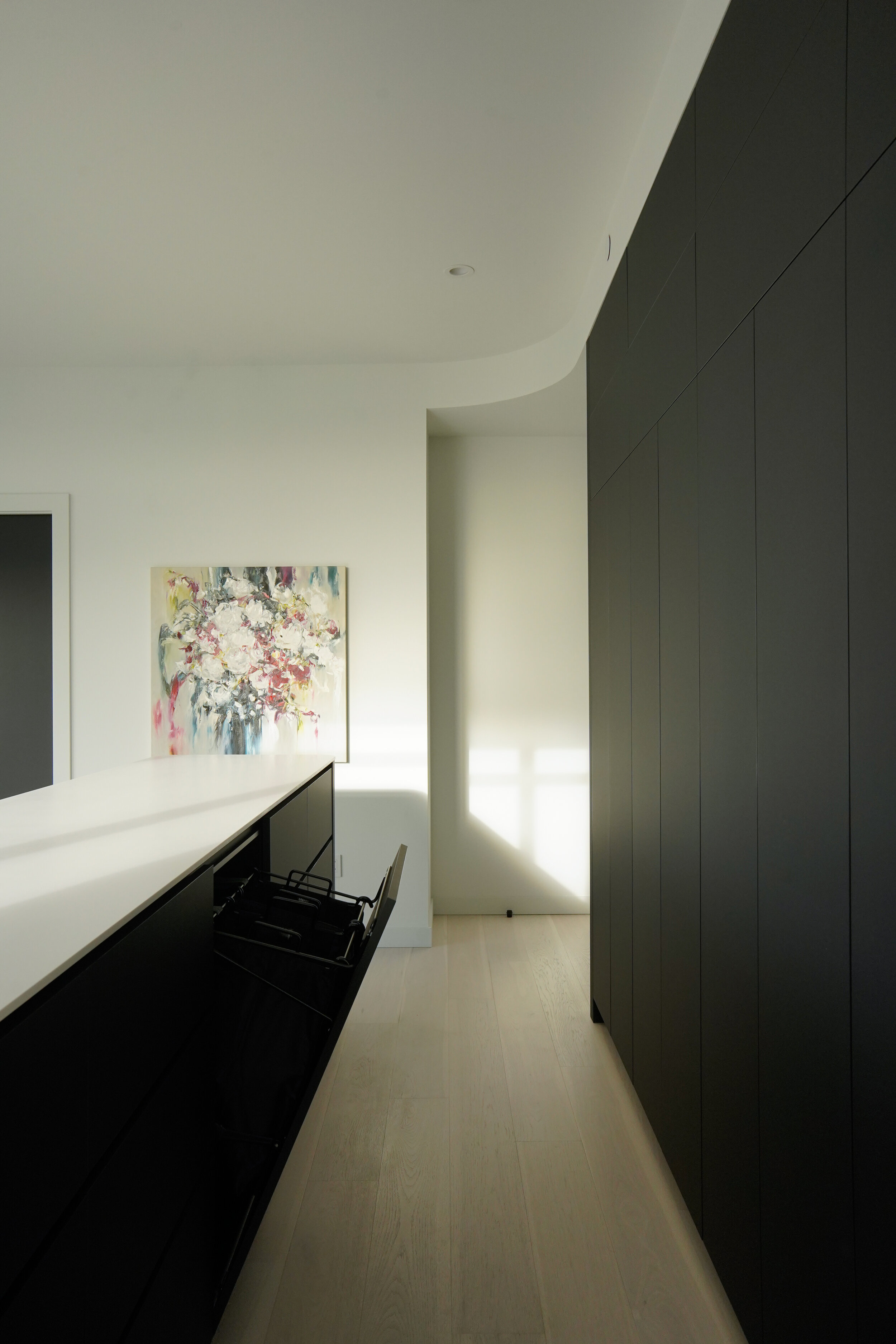
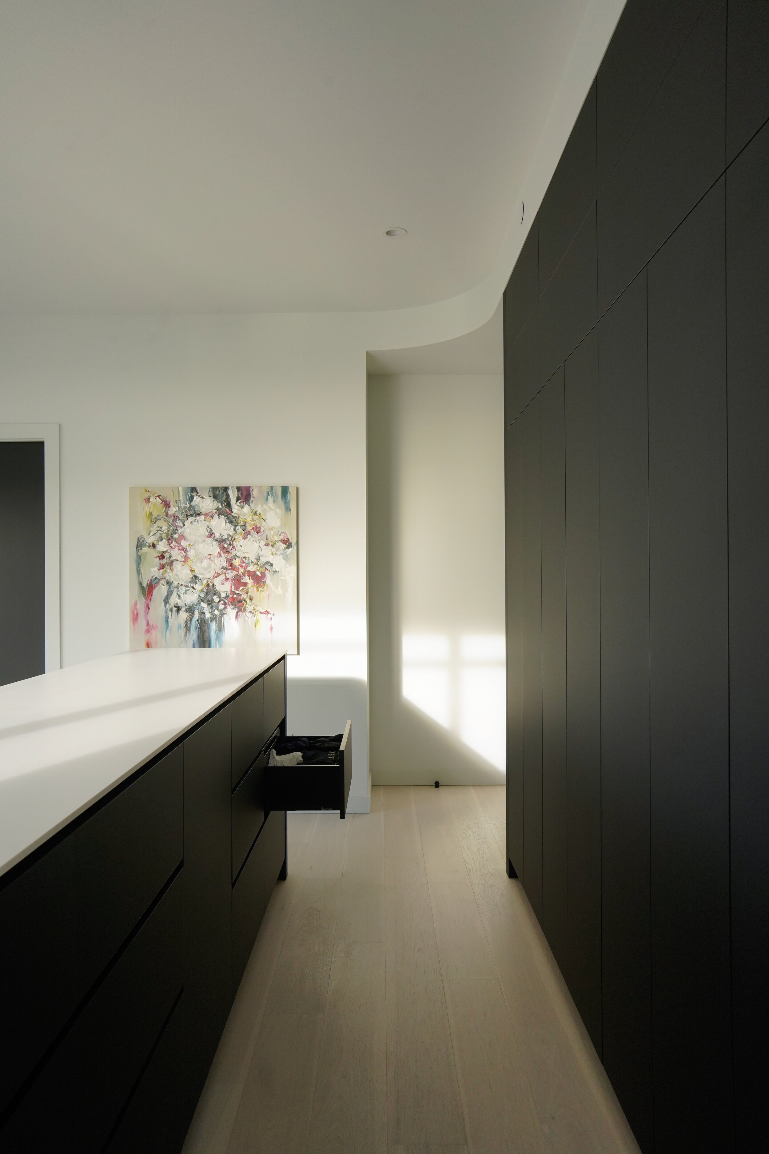
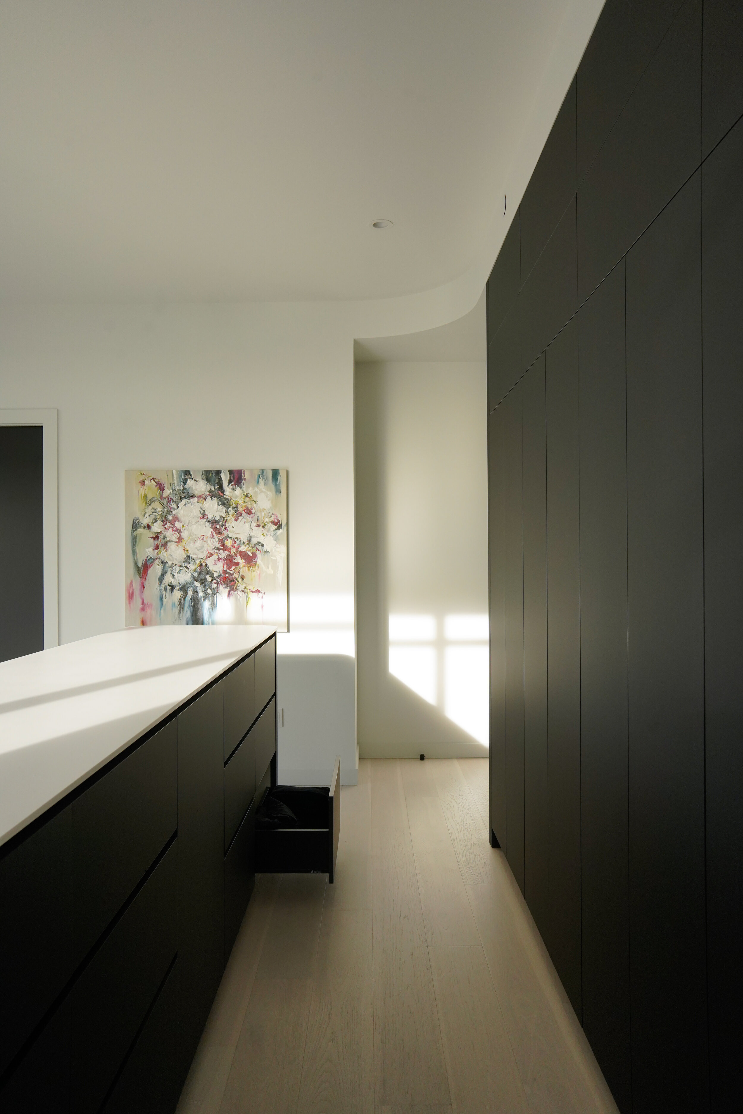
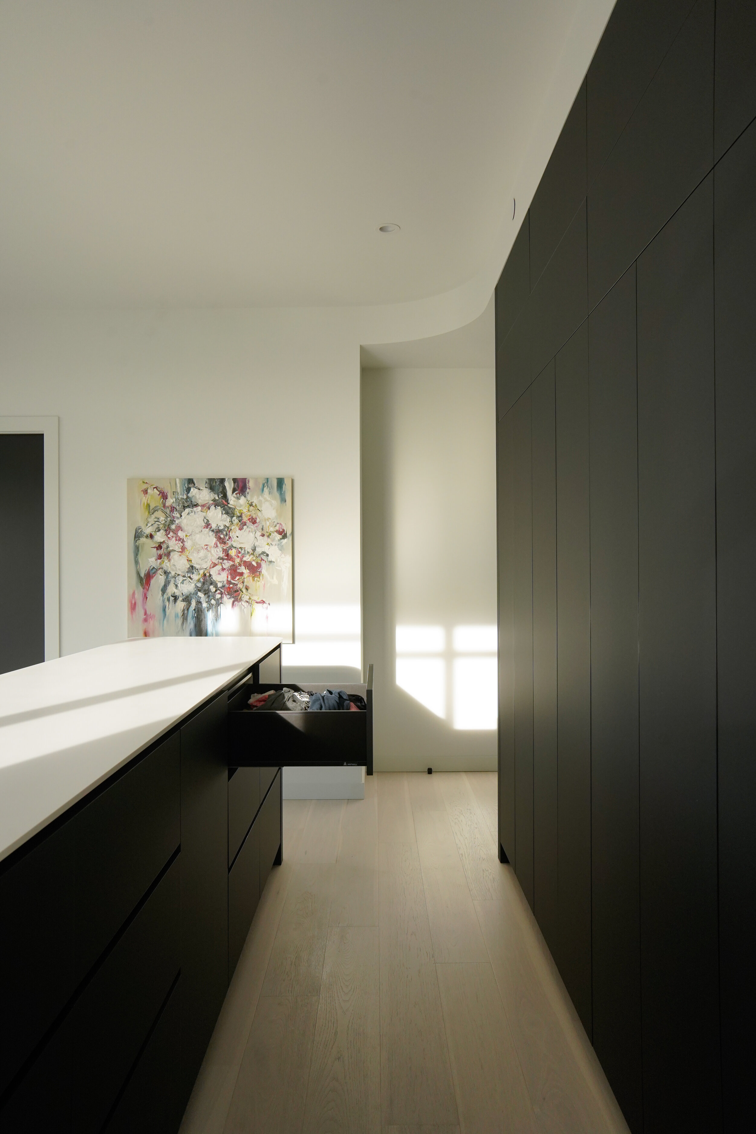
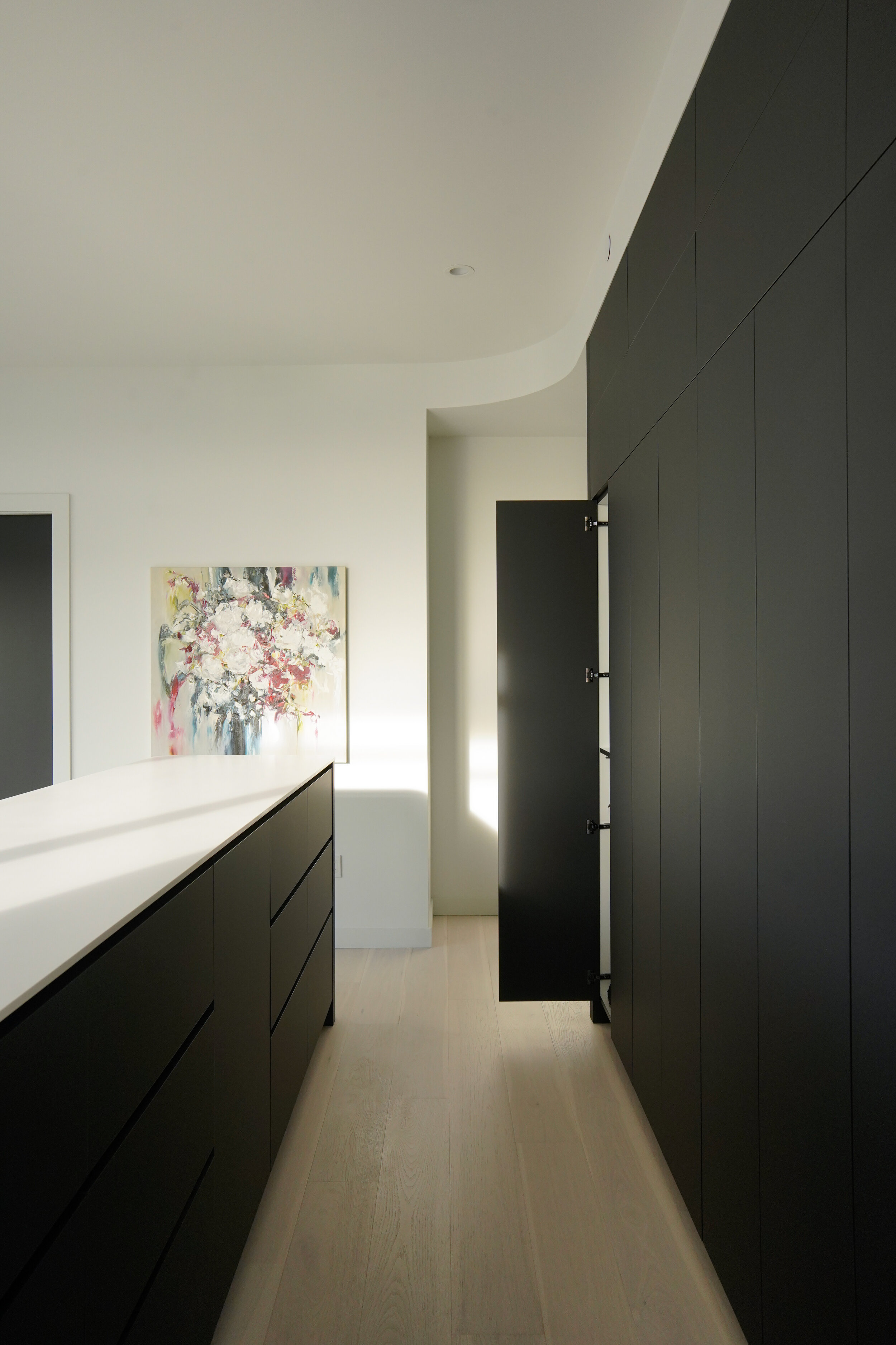
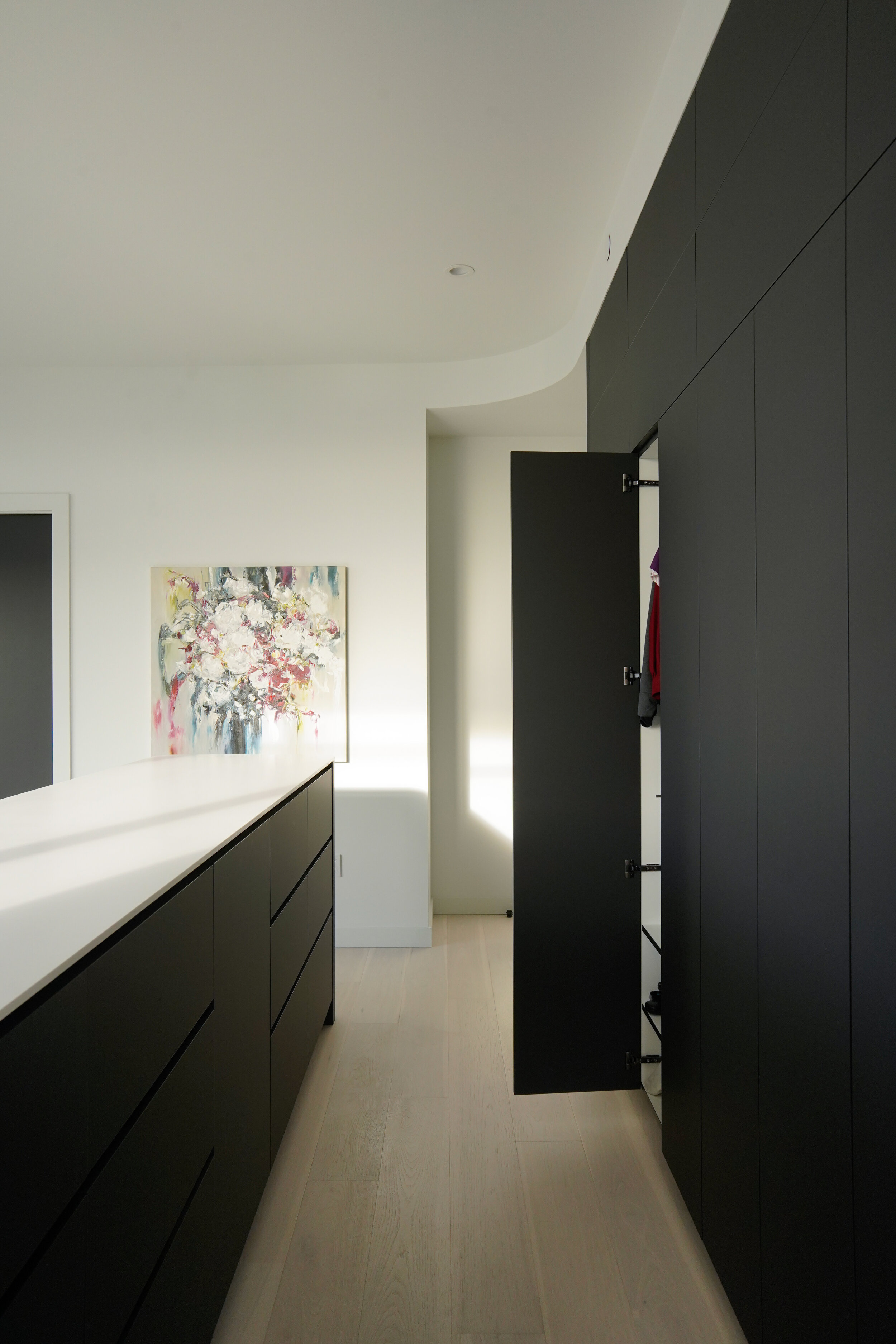
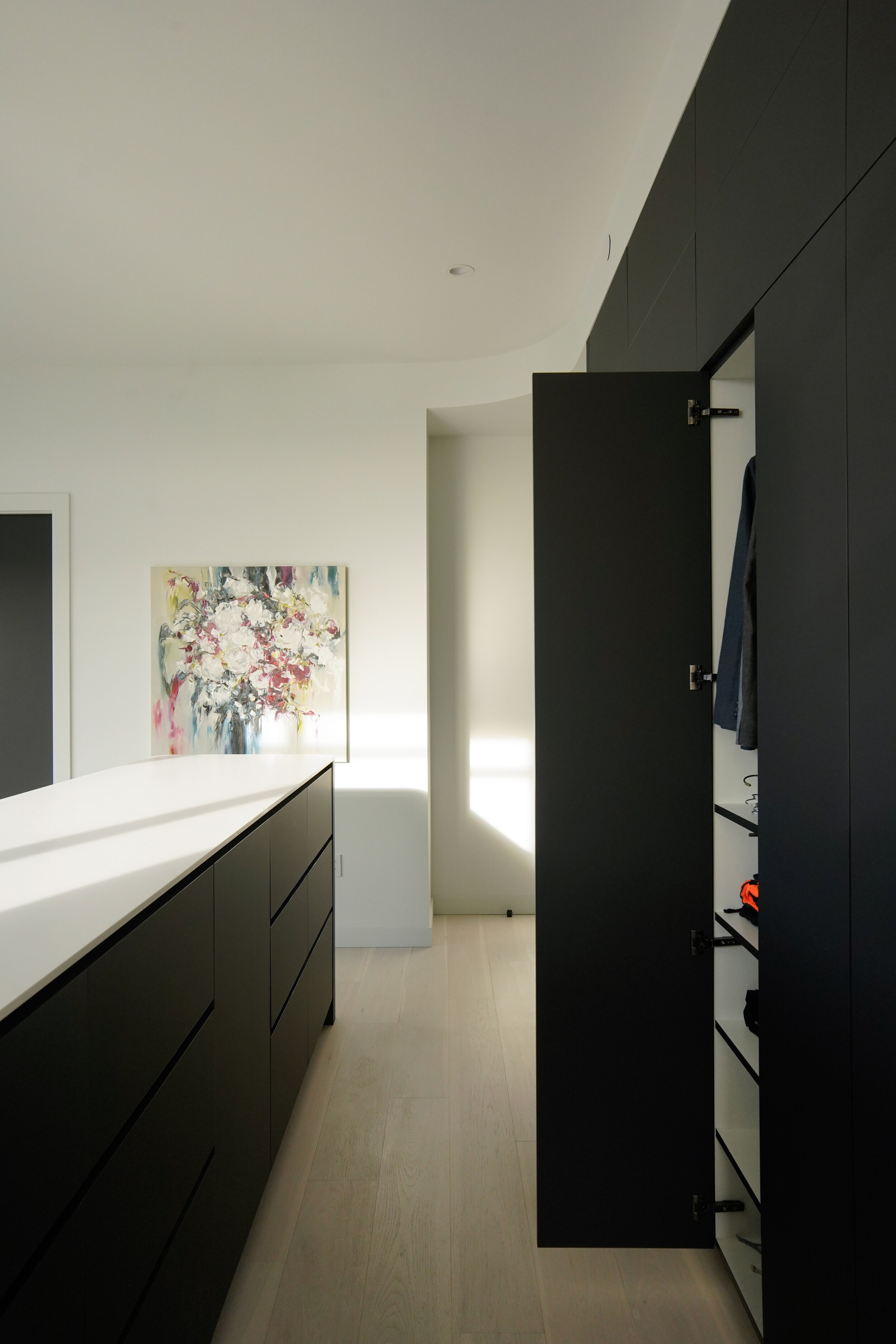
We decided to carry the curves from the view-framing archway in the front room to the rest of the apartment, incorporating it into the millwork and architecture in large and small ways. In the kitchen and media wall millwork, you will see that we have capped each side of the cabinetry with large floor to ceiling minimalist curved columns. The kitchen island has this treatment as well on a slightly smaller scale. This detail helps soften the large structures and make them feel more welcoming - less imposing. It also smoothens the transition into the hallway, down which the private zone of the apartment lies.
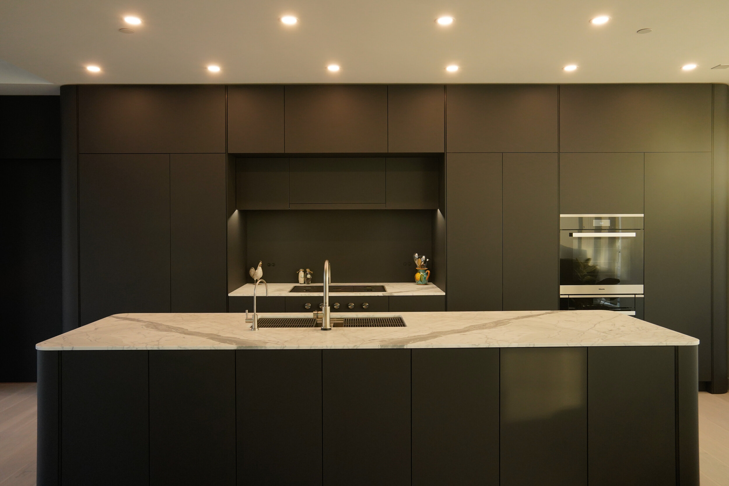
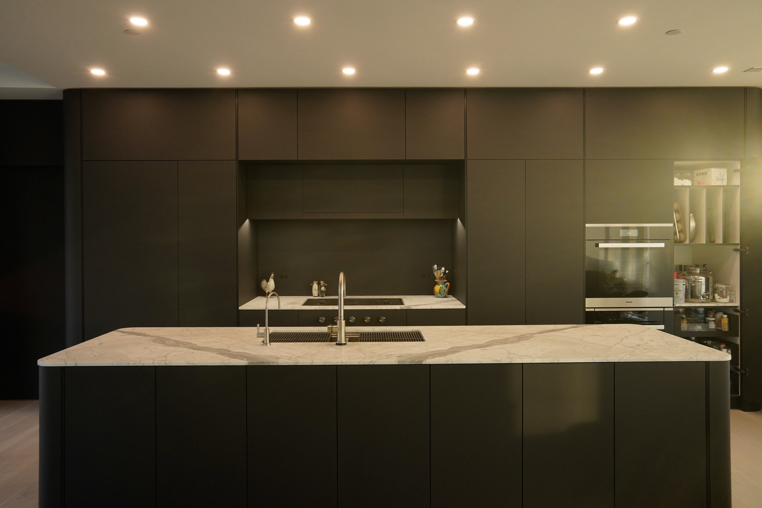
We chose ultra matte Polaris laminate from Abet as the finish for the kitchen and media wall. This is a luxurious soft black with a lovely feel to touch and amazing fingerprint proof qualities. We had chosen a bleached hickory for the flooring in the apartment and the nearly 35 feet of black cabinetry rose up in stark contrast all the way to the ceiling. The soft curves and soft material saved it from looking too severe and instead struck a nice balance between bold and comforting. The addition of a beautifully veined Carrera marble for the countertops added an organic warmth as only natural materials can.
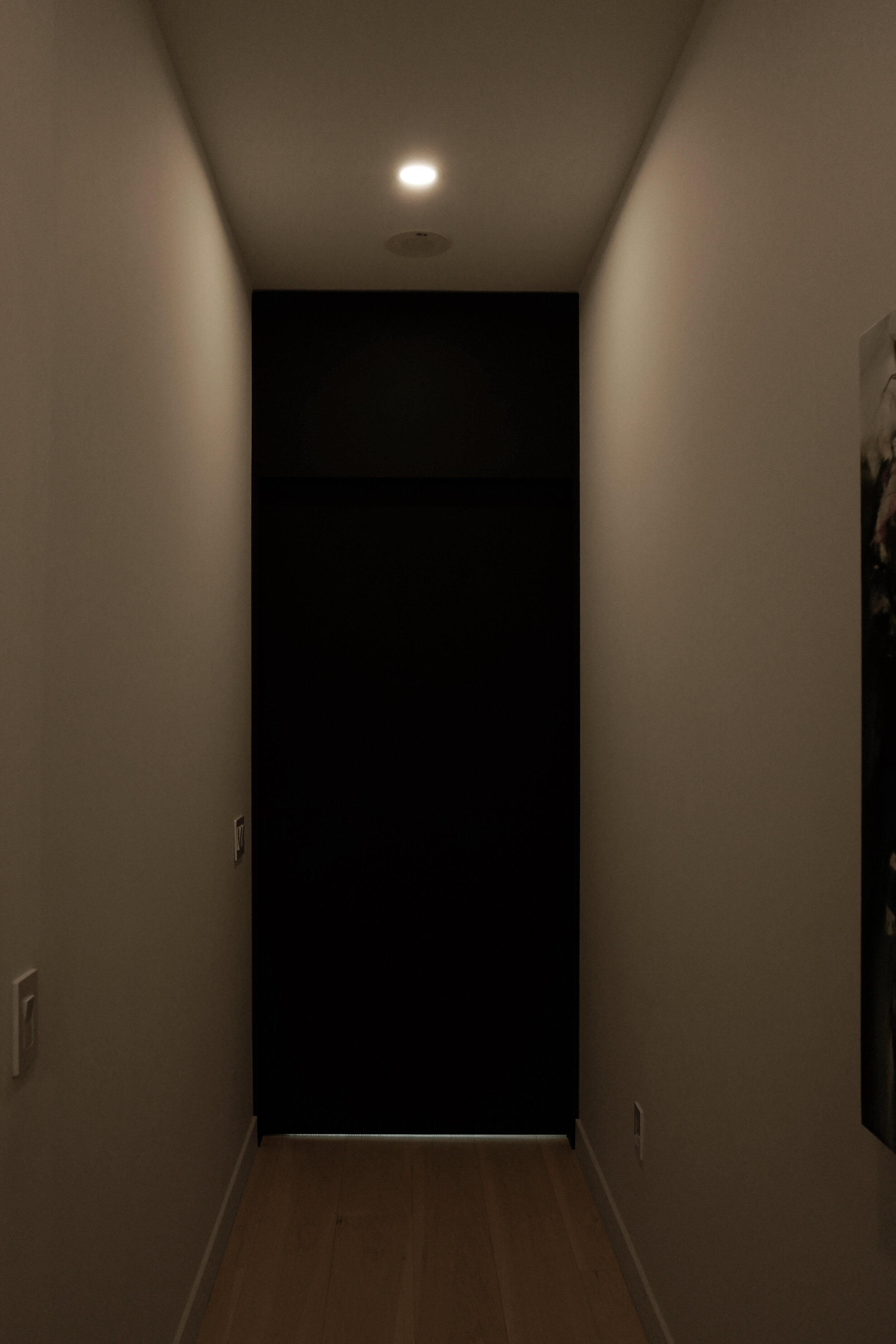
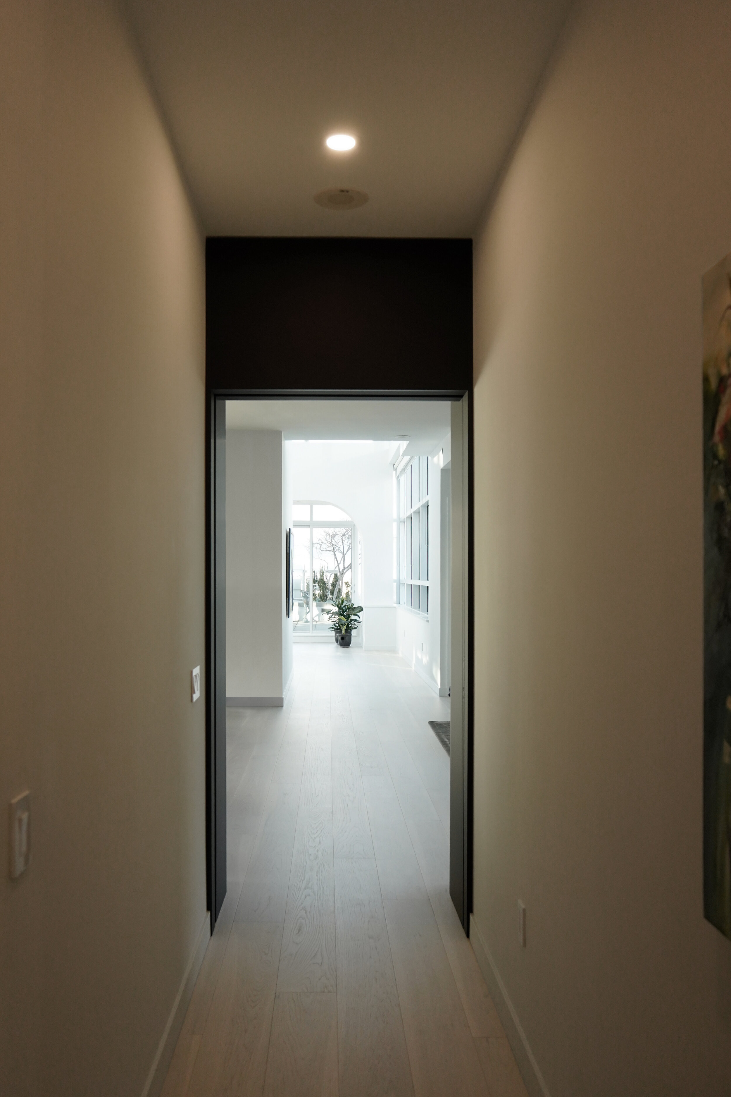
The pocket door leading to the hallway was incorporated into the millwork. This door helped to separate the public from private areas of the house. Notice the curved columns again and their subtle welcoming effect.
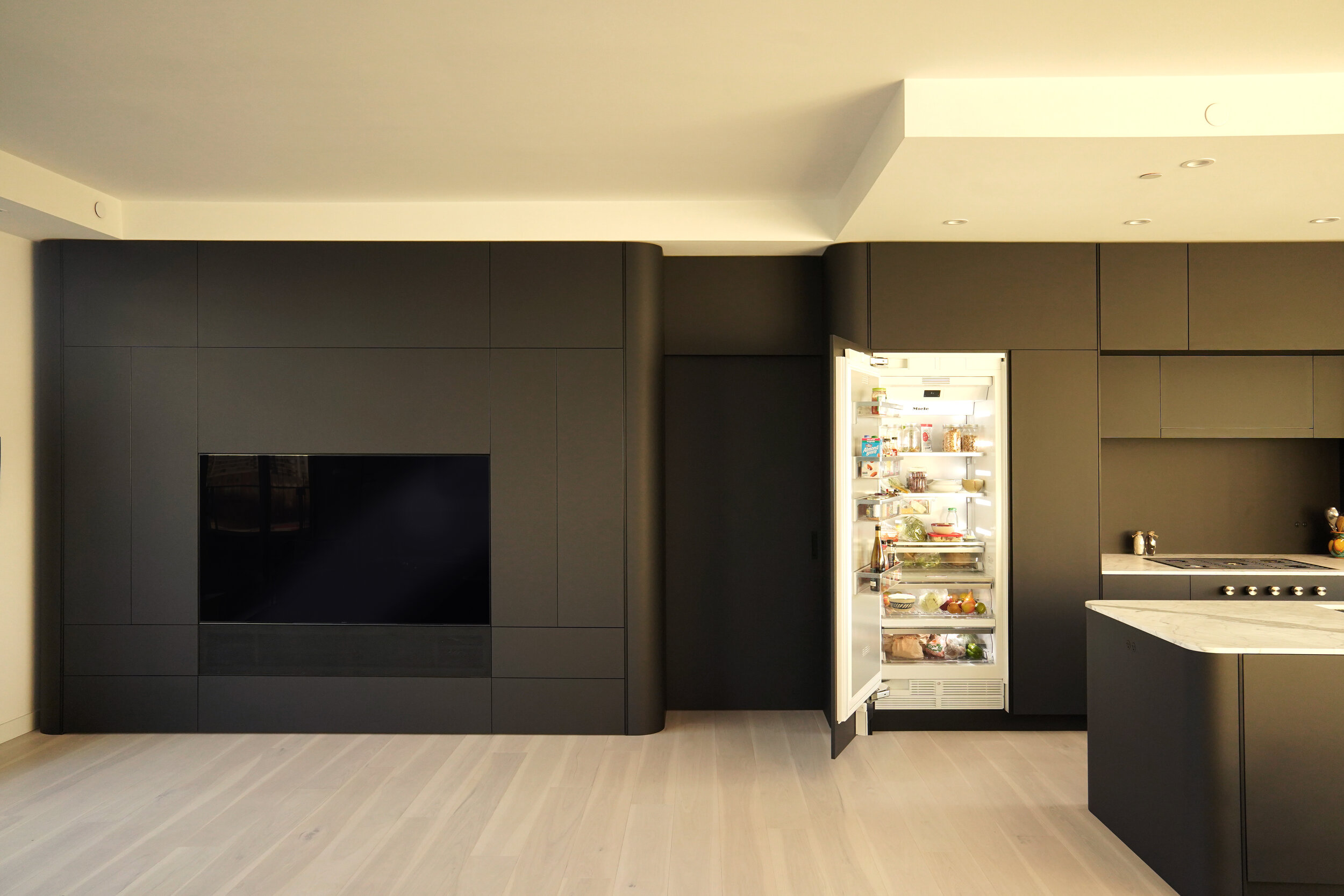
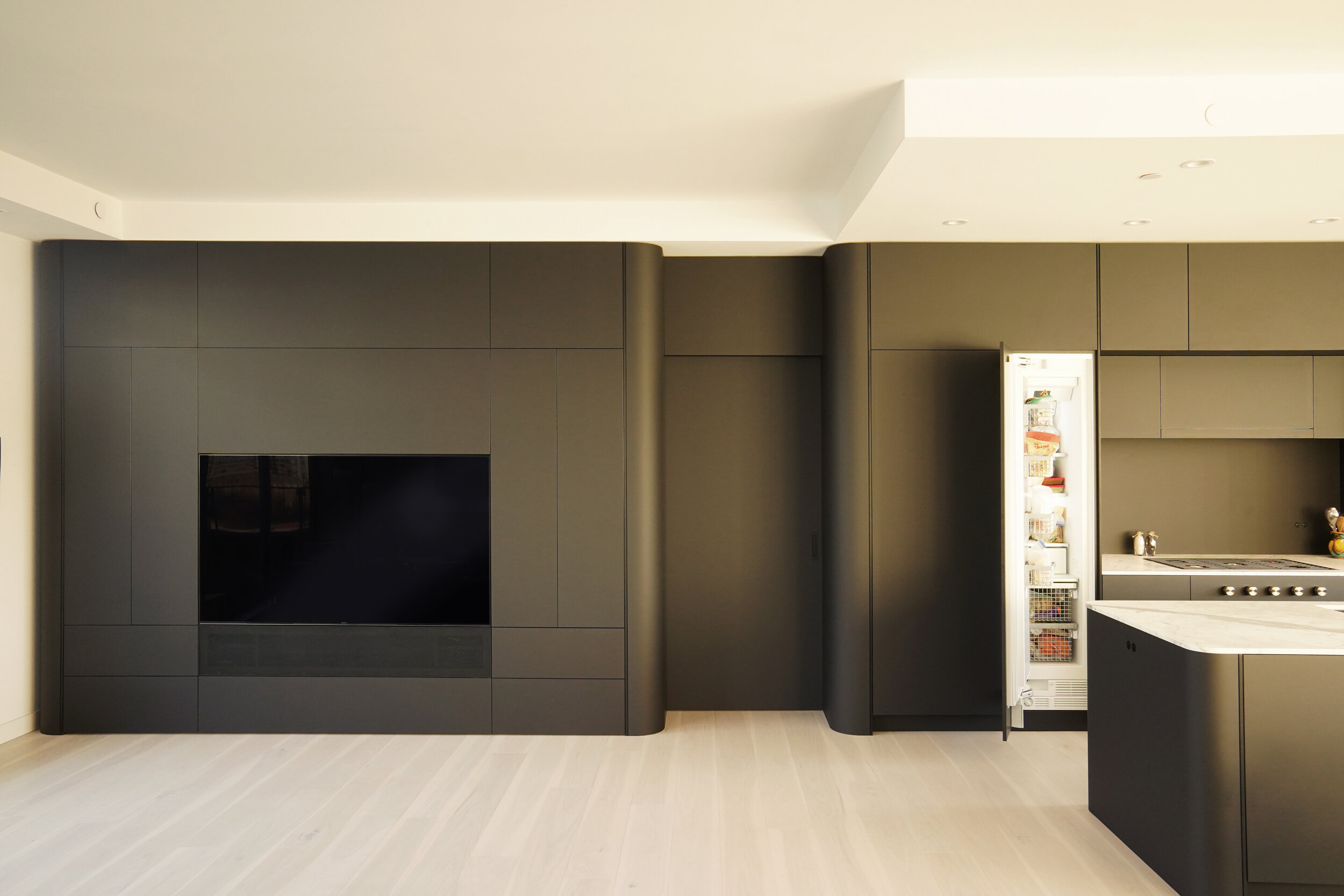
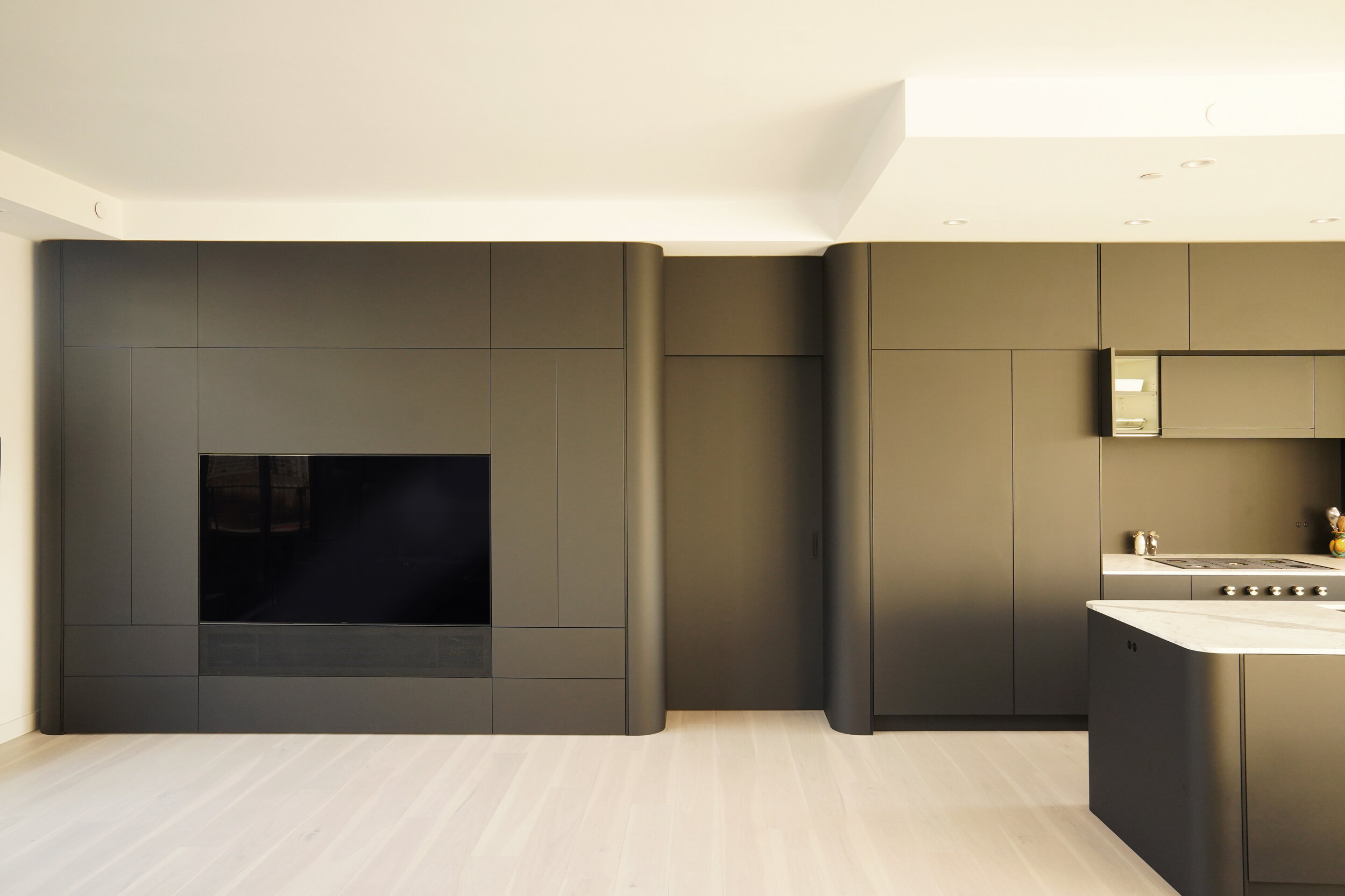
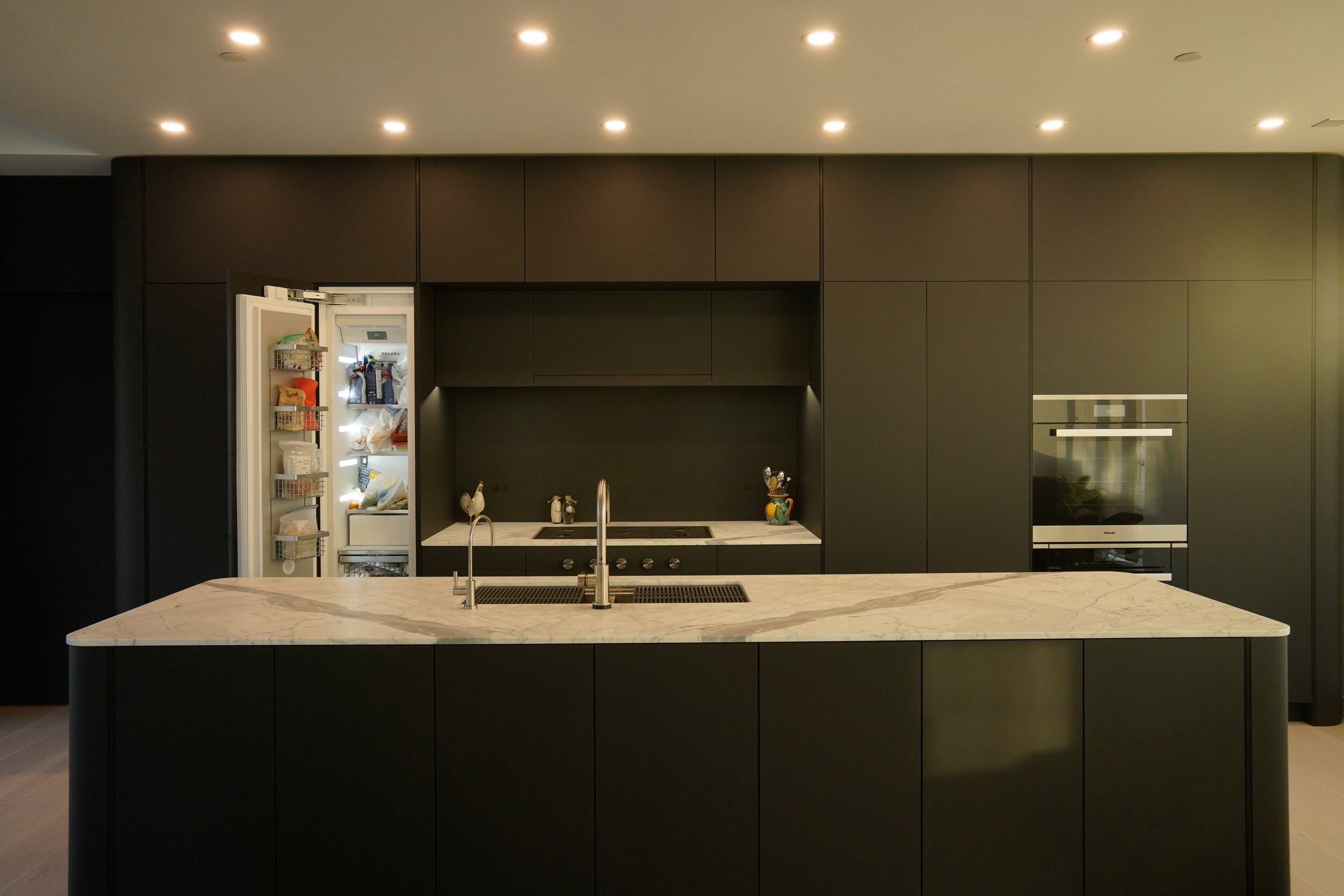
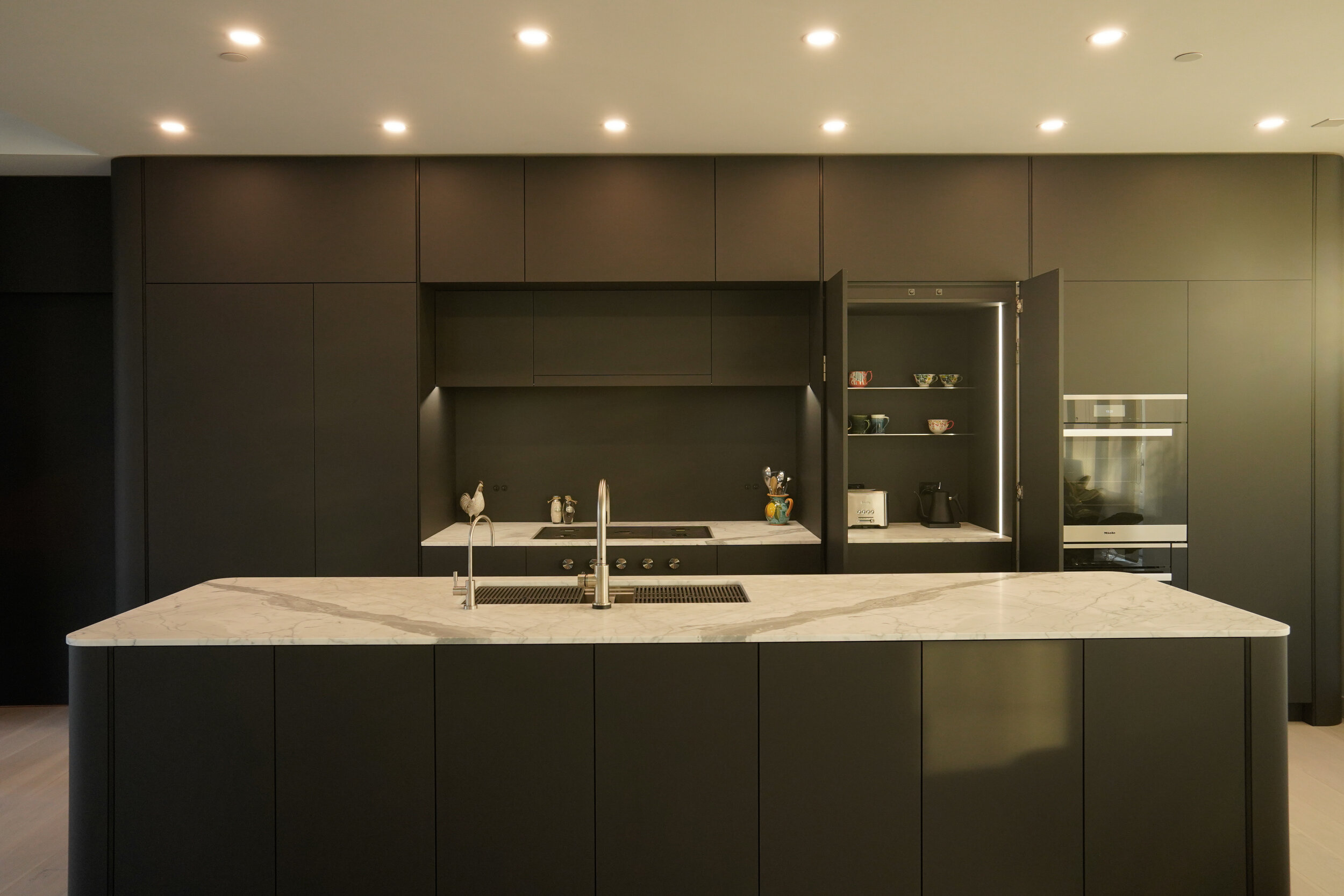
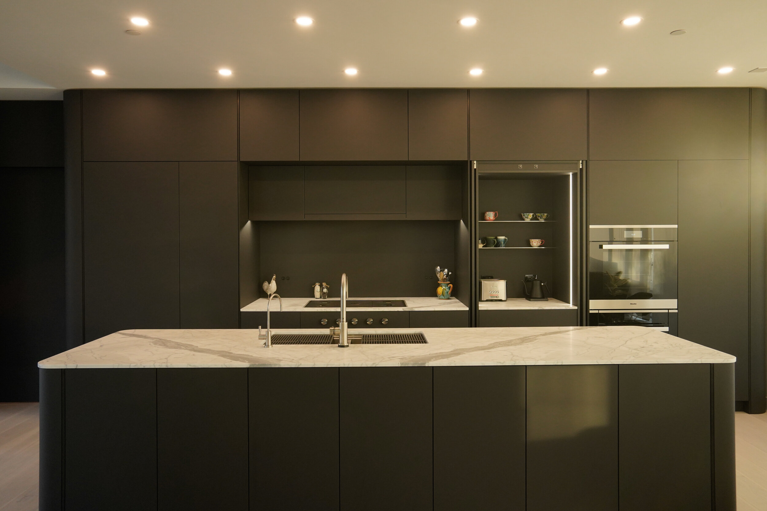
The kitchen was completely handle-less and incorporated large amounts of food and material storage behind it’s very clean lines. We added a large appliance garage to the right of the cooking area as well. This way all large appliances could be plugged in, on the counter, and ready for use, but able to be easily hidden behind closed doors when cooking time was over. The large doors had small motors above them that opened at a touch and slid back into pockets so that they would not be in the way when the appliances were in use.
The Miele fridge and freezer both were equipped with Push2open technology allowing us to extend our handleless aesthetic to these largest of appliances too. The dishwasher and wine fridge also had Knock2open built in so that a simple rap of the knuckles popped the doors right open.
Ultra thin yet robust stainless steel shelves were added to the appliance garage. This flash of metal echoed the stove and ovens on either side.
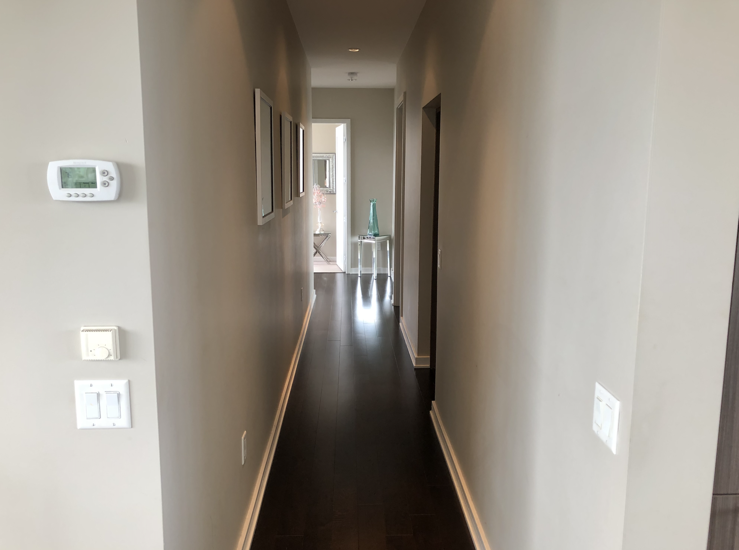
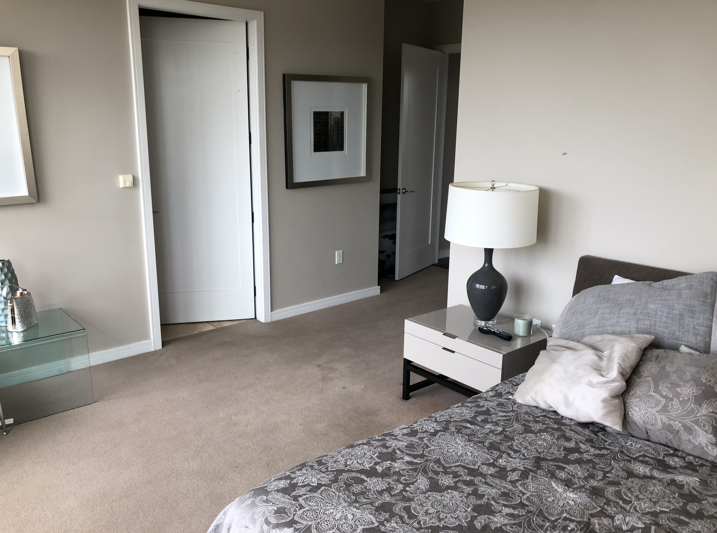
Going down the hall to the bedrooms, we replaced all the doors in the apartment with over-height flat panels and painted them to match the kitchen millwork. This emphasized the high ceiling height in the apartment and helped to unify the design elements throughout.
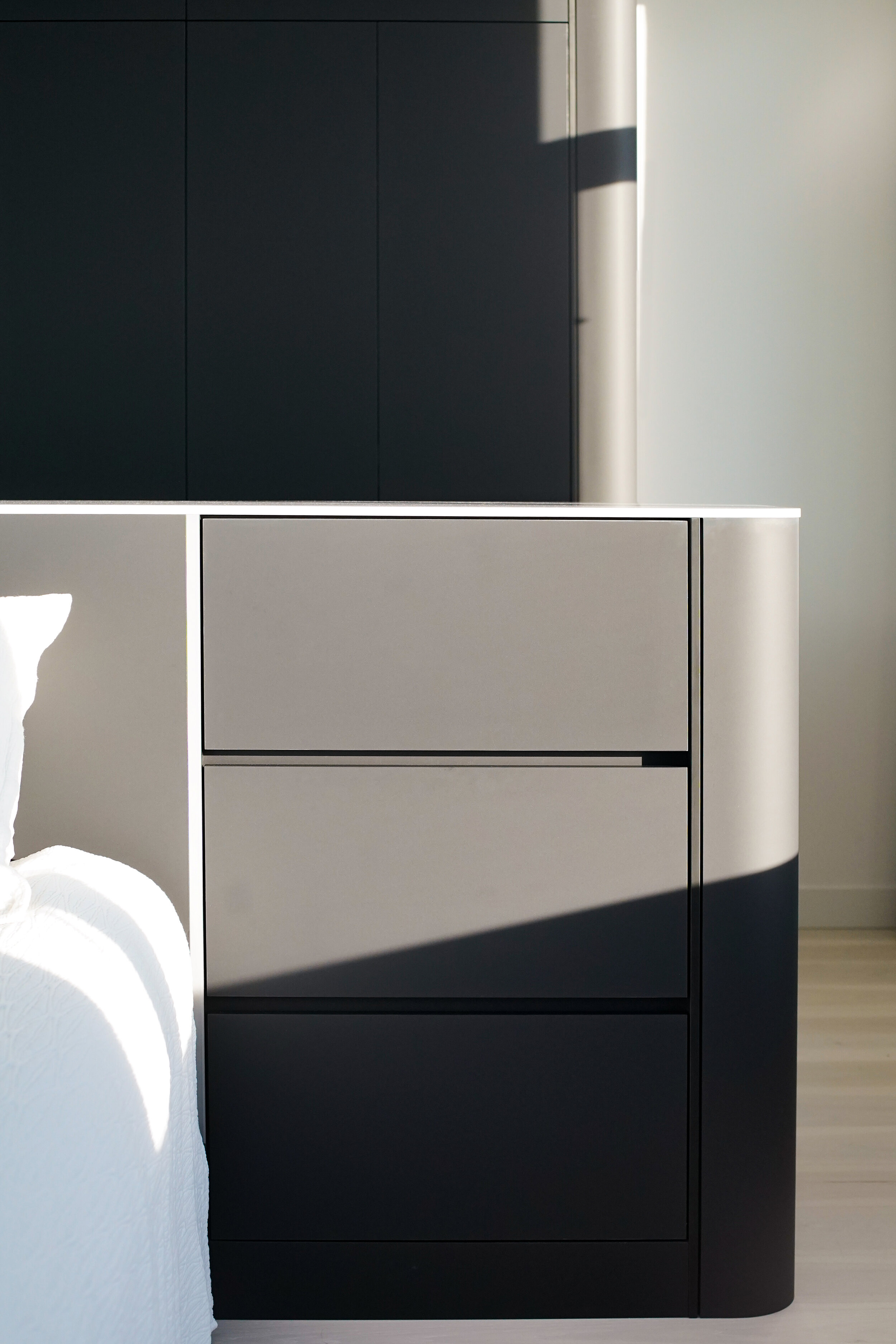
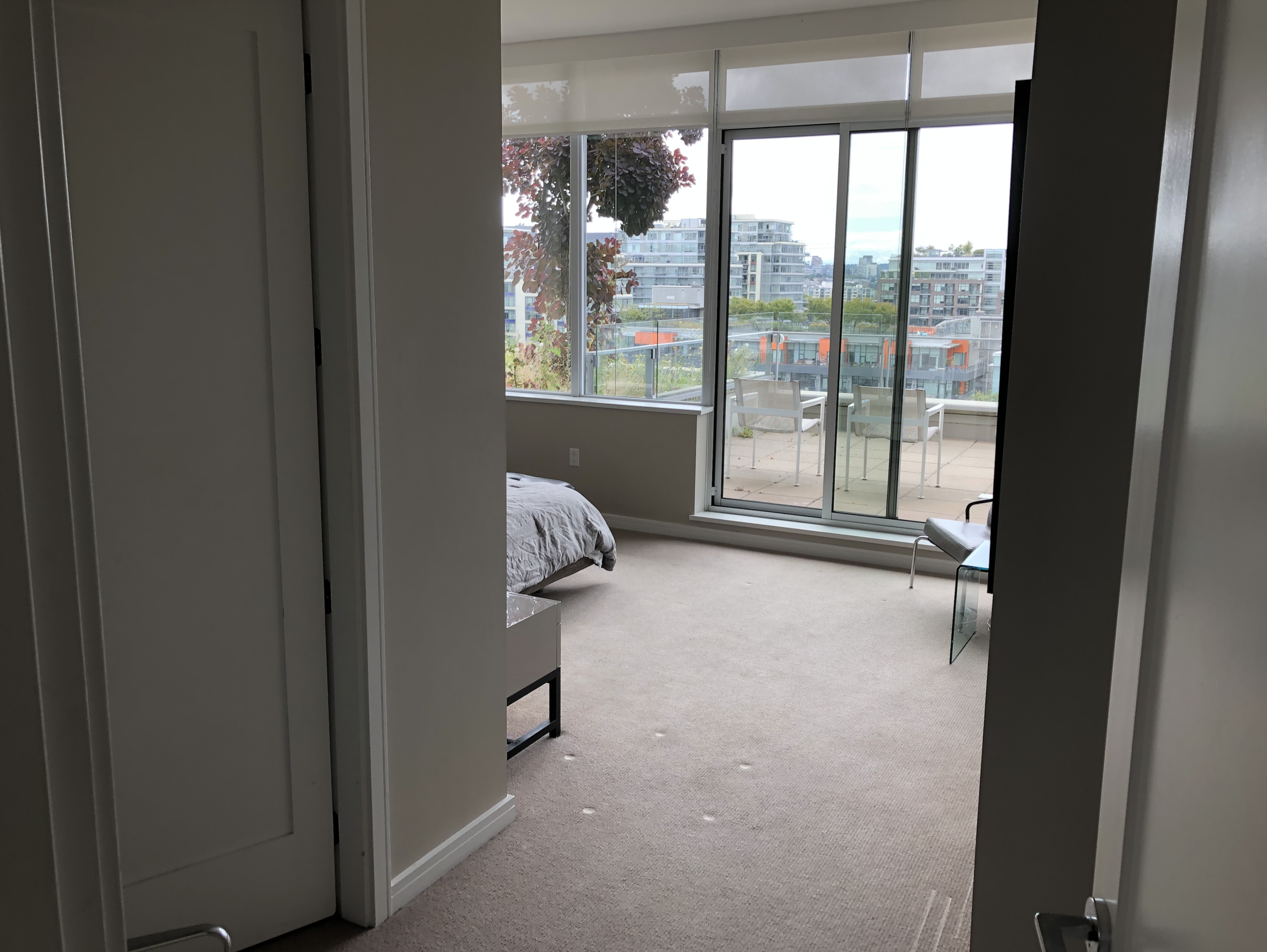
The master bedroom and walk-in closet had previously been two separate rooms. This made the bedroom portion of it seem undersized and poorly laid out. We knocked down the wall between them to open the space up and give the bedroom more light by granting greater southern exposure through the extra windows. The closet room’s function was replaced by a wardrobe wall. The headboard of the king sized bed also had dresser drawers incorporated into the opposite side. Smarter storage layout allowed us to expand the bedroom without losing any of the clothes storage the old walk-in provided.
The same subtle curves seen in the front room and the kitchen/media wall are repeated here in the millwork. They are matched by sweeping curves in the drywall bulkhead above. Flowing fabrics such as the French linen drapes and bedding soften the structures further. The room achieves a serene simplicity through the right blend of hard and soft, light and dark, and curved and straight.
The headboard has two flap down nightstands on either side of the bed. As well, it also incorporates linear LED reading lights that are switched and dimmed through a capacitive switch hidden in the headboard panel. A simple wave of your hand over the panel will softly fade your light on or off. Hold your hand on the panel and it will slowly fade brighter or dimmer and remember your setting for next time.
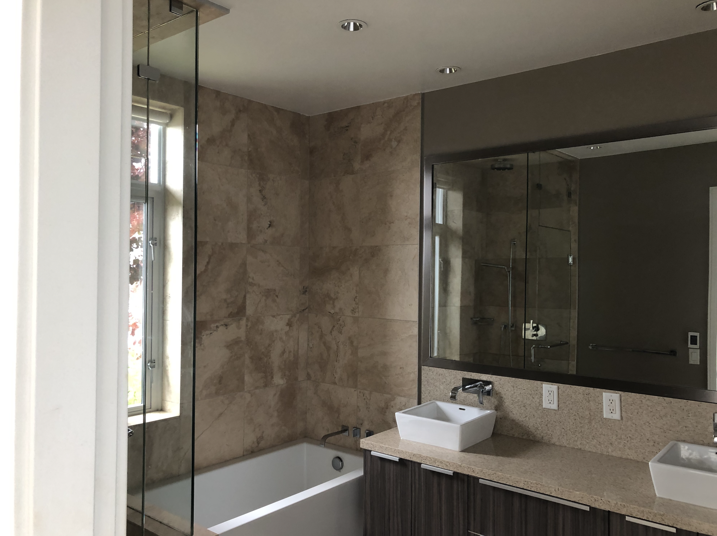
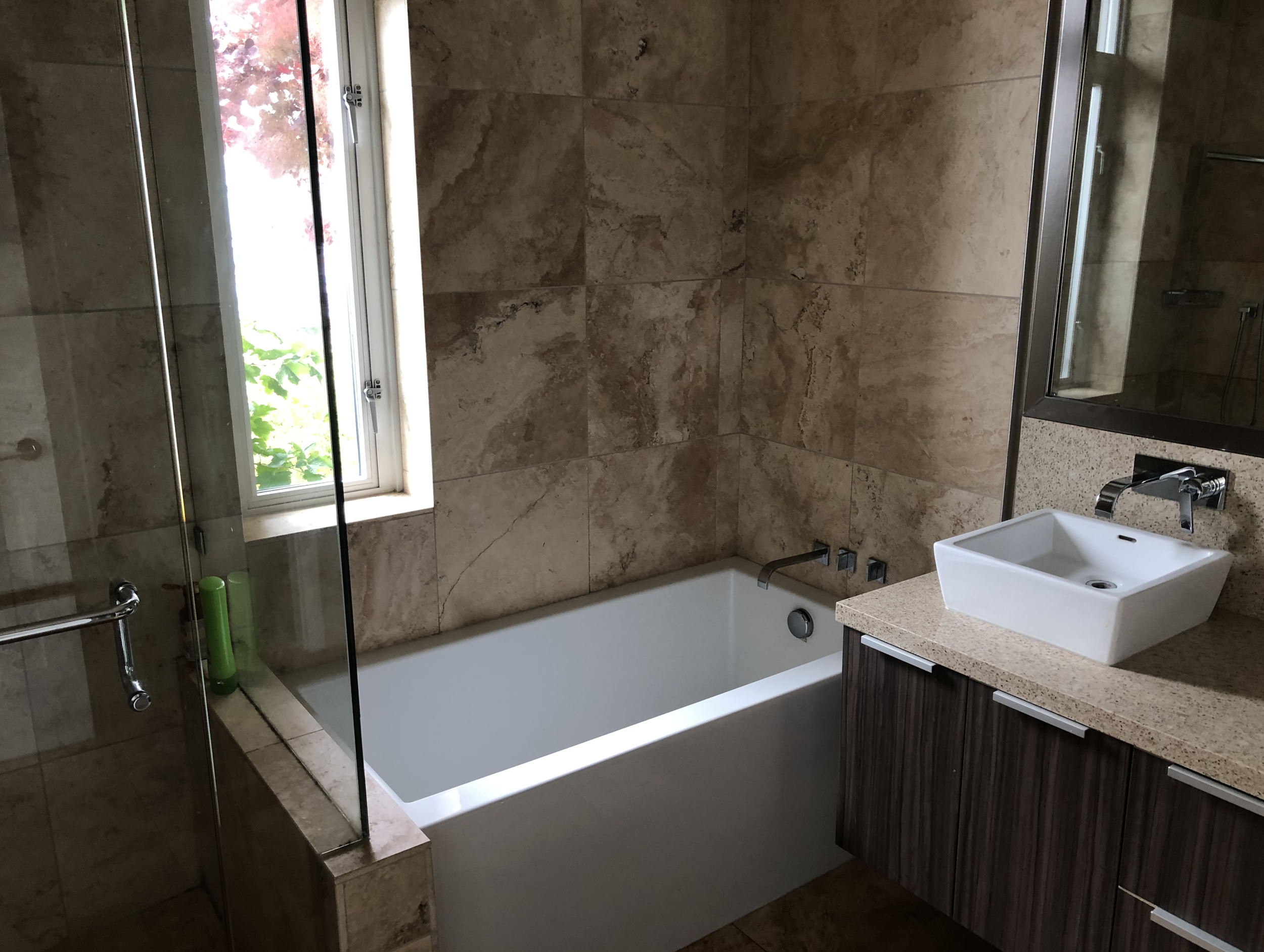
Through a pocket door, we enter into the master ensuite. In a nod to the client’s Greek heritage, we chose marble tiles for all surfaces. The organic elements were well suited to help us supply them with a calm reflective space to steam, shower, or relax in the tub.
The black and white colour palette continued in the bathroom spaces. The vanities were also given slight curved edges on their doors, finish gables and countertops to harmonize with the design in the rest of the home. Solid surface sinks were seamlessly joined to the counters and again the straight sides and slight curved corners were repeated.
The shower enclosure was sealed and a steam generator was added to provide a spa-like experience. The shower glass is all held in black anodized channels effectively using the dark lines to delineate the space. Matte black fixtures complete the look.
The mirrors house medicine cabinets behind and have built in lights that softly illuminate the face from the front for a much more flattering effect. Inside are 1/4” thick black anodized aluminum shelves to hold all the assorted toiletries.
Laundry was also moved into the spacious ensuite, freeing up the old laundry room to become a home office to provide a quiet corner in which to work.
The other two ensuites in the back portion of the home were finished in a similar manner, keeping the look consistent throughout.
As the door opens from the hallway to the front part of the house, you can appreciate from another vantage point the results of removing the hallway closet opposite the powder room. The view to the front room is unobstructed and the trees and mountains are there to greet you each morning.
The old powder room was made more compact and a smaller coat closet was put in front to replace the one removed to open up the passageway. it is now almost three times as wide and does not feel constricting as it once did.
The transformation achieved in the renovation was remarkable. Everything was simplified, unified, and carefully considered. A simple colour palette was used to provide a neutral base upon which the owners could apply their own personal flair and have it be noticed. Small repeated design motifs created a unity among formerly disparate elements. Rooms were enlarged, visually pared down, and connections expanded. The result is a bright, serene space with supreme livability that the clients will enjoy for years to come.


